First, I’d like to thank our awesome judges, who went through 2 difficult rounds of judging and discussion to help select the winners!
“Judging this was so difficult. I was blown away by the creativity.“ – Karen Lopez“Every single entry was compelling.” – Natasha
As described in the original post, we had 3 categories to be won, which can be summarized as follows:
- Most Beautiful – depicted the original visualization’s data in a visually impressive way
- Most Informational – most effectively/readably communicates the data from the original visualization
- Most Fun! – made the judges smile
There was no category where there was a clear winning crafty data visualization. Everyone who entered put their heart into it and had some creative, beautiful, fun, and informative handmade art! Without further ado, here are the top selections:
Most Beautiful
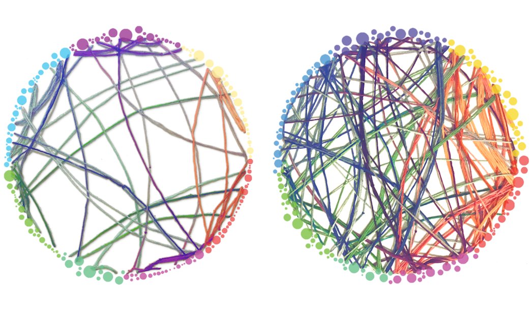
In the Most Beautiful category, the 5 judges initially selected 5 different winners! Eventually, they came to agreement on Patti Shih’s submission, comparing normal brain connectivity to connectivity “while tripping on magic mushrooms”:
(original)
“Patti was able to almost perfectly recreate the original dataviz using something as cozy as string. The choice of colors manages to make it even more visually appealing than the original.” – Emil Hvitfeldt
“Circos diagrams, although hard to gain insight from, are pretty. By sculpturing layers with string, Patti enhanced both their beauty and their informational value.” – Helena Jambor
Honorable Mention
The runner up in the Most Beautiful category was a twisted-metal tree representing a dendrogram of the students that Alli Torban’s (Host of Data Viz Today Podcast) mother taught throughout her career.
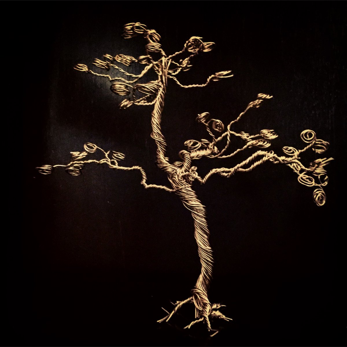
“The tree is very very beautifully done and photographed – serves both as reminder that tree-diagrams can be shown in 3D and is in itself almost a sculpture! “ – Helena
Most Informational
In this category, Amy Cesal’s two entries dominated; both of her Play-Doh-based visualizations won the most votes in the original round. They were also strong contenders in the Most Beautiful category. In the end, the judges selected the “joy plot” (aka ridgeline plot) of the Perceptions of Probability for its effectiveness in conveying the meaning of the original data visualization.
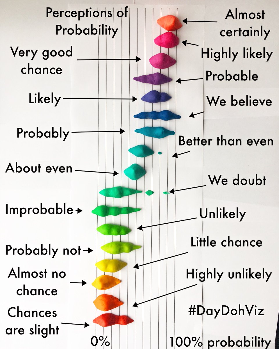
“Joy plots were recently re-popularized by @ClausWilke and are both fun and informative. Amy captured its full essence while choosing visually stunning Play-doh colors. Absolutely beautiful!” – Sean Law
Honorable Mention
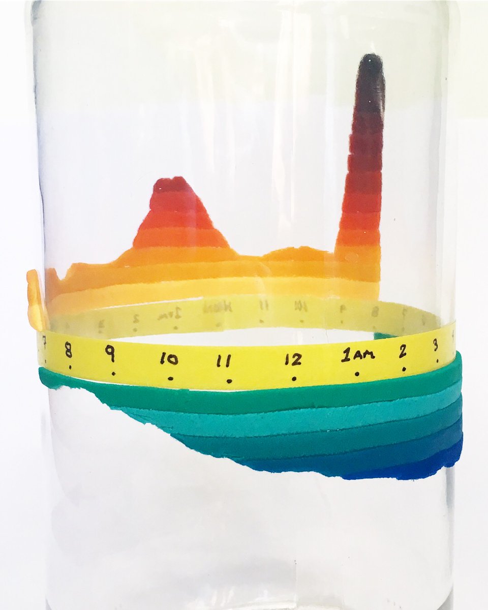
Amy Cesal’s 2nd entry on birth time patterns was the other top choice in the Most Informational category.
(original)
“A creative use of Play-doh on top of a 3-D object makes me a big fan of Amy Cesal. I never thought that Nadieh Bremer’s wonderfully informative work could be improved upon but this is one beautiful exception!” – Sean Law
“I loved that this crafty version made the original data viz more understandable due to adding another dimension. “ – Karen Lopez
Most Fun
This subjective category also had multiple top picks in the first round of judging. After much deliberation, the judges chose Jon Schwabish’s daughter’s entry depicting her Halloween candy haul! Definitely fun, especially the mysterious “MEGA” category!
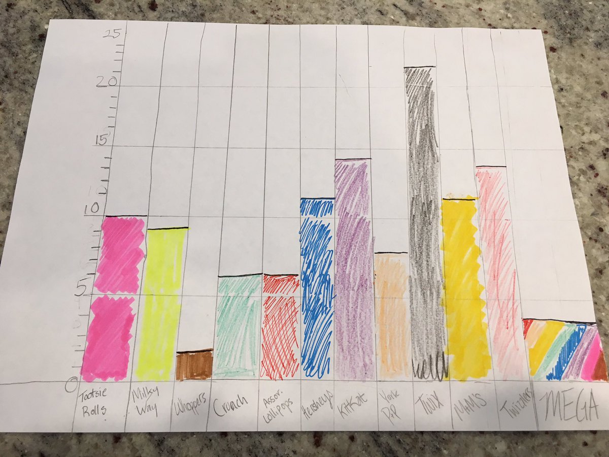
And to add to the fun, Hadrien Lacroix reverse-engineered a digital version!
“The joy and childlike wonder displayed in this dataviz brightened my day, which makes this project my choice of “Most Fun”!” – Emil
“The author’s clear zest for each individual data point (ie piece of candy) really shone through!” -Natasha
Honorable Mentions
The judges also thought that Awais Athar and Alli Torban‘s entries were especially fun and interesting!
The 3 category winners will get their choice of item from the Becoming a Data Scientist store. Congratulations! And thank you to every person who entered the #CraftyDataViz contest – there were many more awesome entries than we could depict here. This was truly amazing, and I can’t wait to do it again next year! Check out all of the impressive entries in this Twitter Moment!
]]>
Enjoying this bot account
https://t.co/uRTj3LWgDm
— Data Science Renee (@BecomingDataSci) April 24, 2018
Today, I saw this tweet:
you could replicate this by gluing various dried out legumes to poster board if you wanted to https://t.co/icHeUuy4Ob
— Rebecca Williams (@internetrebecca) May 5, 2018
and imagined a census tract visualization made out of dried noodles and beans. Being as spontaneous as usual, I asked if anyone would be interested in having a #CraftyDataViz contest, and several people responded yes! So, here we are. Time to get creative!
Basic Contest Rules:
Find a data visualization online, in a book, or create one yourself. We need a digital version of the viz you’re recreating, so save the link or take a photo of it. Now, gather up some goodies from around the house or yard and/or hit the craft store (or maybe the grocery store!) and recreate that data viz in craft form!
It does need to be a physical end-product – no completely digital entries (though usage of printed elements is ok), but other than that there are no restrictions on materials or approach – get as creative as you want! At least part of it needs to be handmade or manually assembled (so no completely 3D-printed entries, for instance, but parts could be 3D printed) You can replicate the viz in detail, or do an abstract interpretation of it :)
I will find some judges that know something about data visualization, and they will pick winners in each of the following categories (we might do some sort of online vote to narrow down the entries, depending on how many there are):
- Most Beautiful/Visually Impressive – as long as the judges can tell it’s related to the original data viz in some way, it qualifies, and the judges will pick the overall most gorgeous or awe-inspiring outcome to win this category
- Most Informational – to win this category, your visualization needs to be especially readable/interpretable. Judges will pick the one that most effectively communicates the point of the original data viz
- Most Fun! – the definition of this is up to the judges, but if it makes the judges laugh, it probably has a good chance at winning
The winner of each category will be featured here and on my @becomingdatasci twitter account, and win their choice of item from the Becoming a Data Scientist store! By then, I’ll have the 2018 Summer of Data Science items up, since the end of this contest will also mark the launch of #SoDS18!
How to Enter:
Post a tweet (or a comment below if you don’t use twitter) that includes a link or image of the original dataviz, as well as a photo or video of your creation! On twitter, use hashtag #CraftyDataViz so I can find your entry!
The entry period starts today and ends on 11:59PM EDT on Sunday, May 27. I’ll plan to post the entries for viewing/judging on Monday, May 28 (Memorial Day in the United States).
HAVE FUN!! I’m excited to see what you create!!
]]>