Here’s a video of me explaining the analysis:
A few notes as I skim through:
- That part that was broken is where I hadn’t changed from the real IP to the random IP (sorry search bot), so I fixed that in the file below
- I pointed to the wrong thing when I was talking about how long I’d been around…Becoming a Data Scientist Podcast started in December 2015! So 1 year later there was a day larger than the 1st day for the 1st 3 episodes.
- The top IP that got 36 views – I’ll have to look into it, but I think it could be multiple IPs getting assigned the same random number. I’ll take a look and come back when I have a chance.
Here are all of the episodes, so you can go back and listen to any you missed!
You can download the HTML versions of my Jupyter notebooks, and also play with the Tableau dashboards at these links:
“Clean” version of the Jupyter notebook
Full messy analysis Jupyter notebook
Listen monitoring Tableau dashboard
Interactive episodes by week Tableau dashboard
If you have suggestions for how to do the code in a more sensible way than how I rushed and did it, or if you have any questions, feel free to add suggestions in the comments below!
]]>The first activity involved setting up a development environment. Some people are using R, some using python, and there are several different development tools represented. In this thread, several people posted what setup they were using. I posted a “hello world” program and the code to output the package versions.
Activities 1-3 built upon one another to explore a dataset and generate descriptive statistics and visuals, culminating with a business Q&A:
- Activity 1 – Find & Explore a Dataset
- Activity 2 – Visuals for Exploratory Data Analysis
- Activity 3 – Business Questions & Data Answers
I analyzed a subset of data from the eBird bird observation dataset from Cornell Ornithology for these activities. Some highlights included:
– Learning how to use the pandas python package to explore a dataset (code)
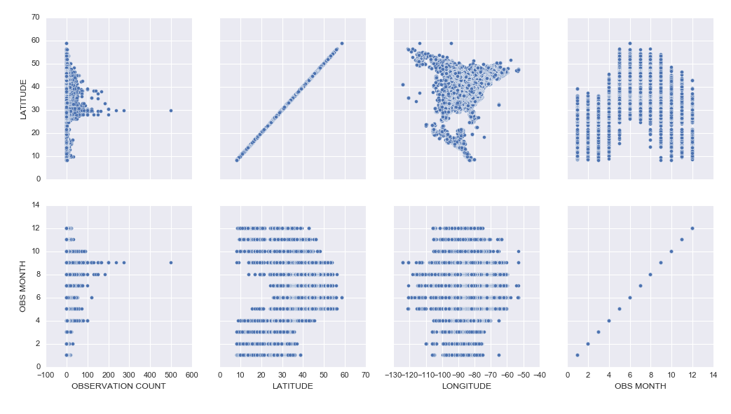
– Learning how to create cool exploratory visuals in Seaborn and Tableau. Here is an example scatterplot matrix made in Seaborn:
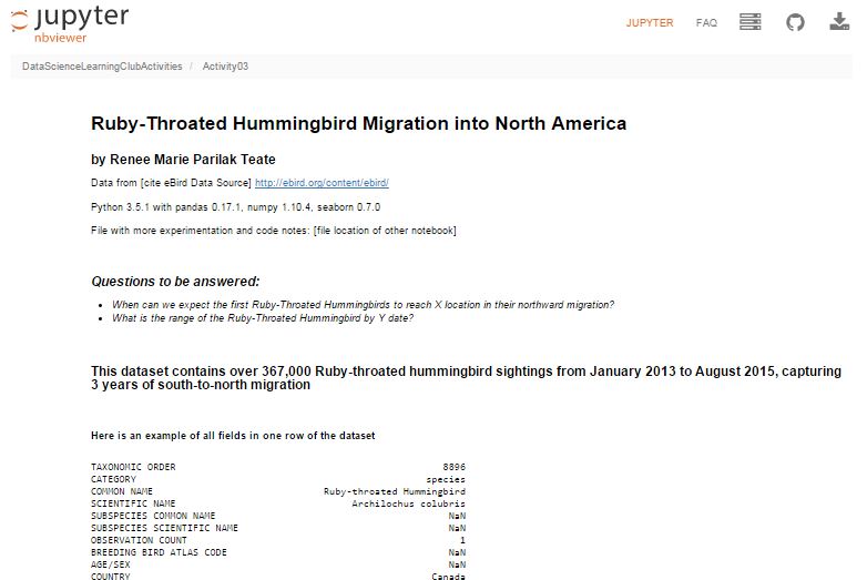
– I was most excited to learn how to build interactive Jupyter Notebook inputs, which I used to control Bokeh data visualizations to display Ruby-Throated Hummingbird migration into North America (notebook). Unfortunately, until I host them on a server where you can run the “live” version, you won’t be able to see the interactive widgets (a slider and dynamic dropdowns), but you can see a video of the slider working here:
Here’s my final output for Activity 3, a Jupyter Notebook (with code hidden, and unfortunately interactive widgets disabled) with the Q&A about the hummingbird migration:
Ruby-Throated Hummingbird Migration into North America
Activity 4 was built as a catch-up week for those of us who were behind, but had some ideas of math concepts to learn for those who had time.
We’re currently working on Activity 5, our first machine learning activity where we’re implementing Naive Bayes Classification.
All of my work is available in this github repository: https://github.com/paix120/DataScienceLearningClubActivities
I strongly encourage you to click through the forums and look at some of the other data explorations the members have been doing, including analysis of NFL data, personal music listening habits, transportation in London, German Soccer League data, top-grossing movies, and more!
It’s never too late to join the Data Science Learning Club! If you aren’t sure where to start, check out the welcome message for some clarification.
I’ll post again when I complete some of the machine learning activities!
]]>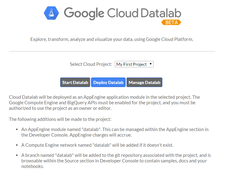
I had a few frustrations with it because the documentation isn’t great, and also sometimes it would silently timeout and it wasn’t clear why nothing was running, but if I stopped all of the services, closed, restarted DataLab, and reopened, everything would work fine again. It’s clearly in Beta, but I had fun learning how to get it up and running, and it was cool to be able to write SQL in a Jupyter notebook.
I tried to connect to my Google Analytics account, but apparently you need a paid Pro account to do that, so I just connected to one of the built-in public datasets. If you view the notebooks, you will see I clearly wasn’t trying to do any in-depth analysis. I was just playing around and getting the queries, dataframes, and charts to work.
I hadn’t planned to get into too many details here, but wanted to share the results. I did jot down notes for myself as I set it up, which I’ll link to below, and you can see the two notebooks I made as I explored DataLab.
Exploring BigQuery and Google Charts
Version Using Pandas and Matplotlib
(These aren’t tidied up to look professional – please forgive any typos or messy approaches!)
Google Cloud Datalab Setup Notes (These are notes I jotted down for myself as I went through the setup steps. Sorry if they’re not intelligible!)
]]>