Recorded at Tom Tom Fest Applied Machine Learning Conference in Charlottesville, VA on April 11, 2019.
Episode 17 Audio
@therriaultphd on twitter
Data and Democracy
This O’Reilly ebook by Andrew Therriault explores how political data science helps to drive everything from overall strategy and messaging to individual voter contacts and advertising.
Data Security for Data Scientists by Andrew Therriault on Medium
Ten practical tips for protecting your data (and more importantly, everyone else’s!)
World premiere
— Data Science Connect (@DataScienceATL) April 11, 2019
]]>Our first ever live audience for Becoming a Data Scientist podcast at #AMLCville! With @therriaultphd! pic.twitter.com/JA1RpiKq0u
— Data Science Renee (@BecomingDataSci) April 11, 2019
Here is the link to the previous post, which has a pdf version of the slides that’s almost identical, and a video from when I gave this talk at Tom Tom Fest Applied Machine Learning Conference in 2018.
Here’s the blog post that was the start of researching this topic, for me.
Here’s the twitter list of people who talk about Ethics & Law in AI/ML.
And here’s the flipboard magazine where I collect articles on this topic.
Enjoy!
]]>I plan to come back and add more info here in the future, but for now, here is a PDF version of my slides:
My Journey from Advancement Data Analyst to Data Scientist
Week 1 was all about brainstorming ideas and gathering resources – dreaming up what you’d love to learn, and finding content that will help you learn it.
Week 2 (which started yesterday, but don’t worry, jump in any time even if you see this blog post a month from now) is all about goal-setting.
You should set a #SoDS18 goal that’s lofty enough to excite and motivate you, but not so out of reach that you’ll never complete it and only get disheartened when halfway through the summer you realize you are only 10% of the way there.
Make sure to keep goals attainable! Last year my goals were too expansive and by week 4 there was zero chance of accomplishing all of them which was super demotivating https://t.co/uXiwUFNYU5
— Nick Heitzman
(@NickDoesData) May 28, 2018

I also want to make sure you know what makes a good goal. I like the definition used by the SMART approach:
Your goal should be
- Specific
- Measurable
- Achievable
- Relevant
- Time-Bound
Instead of explaining each of these in detail (you can read more about it elsewhere on the internet), I’m going to give an example of things you can jot down for yourself for each of these, then an example summary tweet for 2 different #SoDS18 goals.
Let’s say the idea you had for what to learn this summer is “Start learning Python”, and the resource you found is DataQuest. Let’s turn that into a SMART goal:
Specific – Learn how to import, clean, and visualize data using python and pandas
Measurable – Complete all courses in the DatQuest Data Scientist Path
Achievable – I can spend at least 6 hours on this project every weekend, plus occasional weekday evenings, so I have enough time available to do the work [Note from Renee: I have not actually researched how long this course series would take to complete]. I have joined the #py4ds Slack community and will ask for help there and on DataQuest if I get stuck so I don’t get set far behind.
Relevant – I want to add python and pandas to my resume, and it’s my first step on my new path to becoming a data scientist, so it’s relevant to my career goals and I’m motivated to accomplish it.
Time-Bound – the Summer of Data Science ends on September 3, so I will finish this first goal by August 3 in order to have time to complete a small project during the last month of #SoDS18.
Example tweet to share this goal with the world:
My 1st#SoDS18 goal: I will learn to import, clean, and visualize data with python & pandas by spending 6-8 hours per week on the Data Scientist Path on DataQuest, and will complete it by August 3. I’ll ask in #py4ds Slack if I need help.
Or, if your idea is to “do a machine learning project using at least 2 different algorithms on some kind of dataset that could help people”. That can be converted to a SMART goal like:
Specific – Learn how to use random forest and logistic regression in R by experimenting with data from the Kaggle DonorsChoose.org Dataset to develop a list of donors to email about a particular type of project request
Measurable – I will complete exploratory data analysis on the available DonorsChoose data files and write a blog post about my findings that includes at least 3 visualizations. Then I will find out what it means to submit a Kaggle Kernel, build 2 machine learning models using random forest and logistic regression algorithms and compare their model evaluation metrics to each other, submit the Kernel (even if the contest period is over), and find and study at least 2 other people’s submissions to understand different approaches to the problem. Then I will write another blog post summarizing my results and findings.
Achievable – I have read about random forest and logistic regression online, and my friend gave me the Introduction to Statistical Learning book so I can better understand these machine learning algorithms. I have a bunch of resources bookmarked online in case I need extra references to understand the book. I will tweet using the #rstats hashtag or talk to my friend if I need help. If I find out the dataset I found isn’t great for learning these 2 algorithms, I will search for another dataset as needed. I can dedicate 2 hours a day 4 days per week to working on the project and researching these topics.
Relevant – I started learning R over the last year and have used it to complete labs at school, but want to expand my machine learning capabilities and apply my skills to a real-world dataset before I start applying for jobs in the fall.
Time-Bound – I have 12 weeks to complete the project this summer.
Example tweet
My #SoDS18 goals are to:
-explore the DonorsChoose Kaggle dataset
-use ISL book & online resources to learn to build random forest and logistic regression models
-create and submit a Kaggle Kernel to help DonorsChoose
-write at least 2 blog posts about it over the next 12 weeks
I think you get the idea!
I should also mention that you don’t want to over-plan. Notice the note about switching datasets if one doesn’t work out – plan to be flexible! You don’t yet know what you’re getting into, and you might need to find more time finding good resources to learn, getting help, or pivoting if your original plan doesn’t work out. That’s OK! Just go with the flow and try to achieve something comparable to your initial goal. But, you need an initial goal in order to figure out where you are relative to it!
So, finish brainstorming your learning ideas and finding resources this week, then narrow it down to a SMART goal, and tweet about it with the #SoDS18 hashtag so we know what you plan to learn during the Summer of Data Science 2018!
And if you’re still looking for project ideas, check out Mara Averick’s post, browse the #SoDS18 hashtag, or join a data science learning community! (More about this in another blog post later this week!)
]]>
But I’m sure the main thing you’re here to find out is how to get involved yourself! So, here are the basics:
How to participate in the Summer of Data Science:
- Pick a thing or a short list of things related to data science that you want to learn more about this summer (or this winter if you’re in the southern hemisphere!)
- Make a plan to learn it (like an online course, a practice project, etc.).
- Share that plan on social media, then post updates as you make progress, with the hashtag #SoDS18.
Here’s a twitter moment with a bunch of entries from #SoDS17 for reference!
We’ll run this one from today – May 28, 2018 – through Labor Day in the U.S. – September 3, 2018. What you can realistically get done in that time depends on where you are in your data science learning journey, what your work schedule and family obligations are like, and many other factors – so think about what’s realistic for you to accomplish during this time.
Week 1 will be about brainstorming and researching possibilities and resources for summer projects, courses, etc. And in Week 2 we’ll set specific goals for the rest of the summer. So, start thinking of ideas now!
If you would like some ideas for beginners, here’s a list of beginner content on my site DataSciGuide:
Recommended Resources for Beginners
You might want to pick a book or course and go through it, trying out the exercises this summer.
I also have a Flipboard where I have collected a bunch of Data Science Tutorials you might want to check out (note: these aren’t all aimed at beginners).
There are also a whole bunch of online communities where you can join others in a project, or ask questions if you get stuck on yours. I’ll be writing another post highlighting those this week!
Follow me on twitter @becomingdatasci, and tweet with the hashtag #SoDS18 when you post updates about your progress! (It’s a good idea to “thread” your tweets throughout the summer, or add them to a Twitter Moment, so others can easily follow along!)
I’ll be retweeting a bunch of people’s ideas and resources, so keep an eye out there for more ideas if you aren’t sure where to start!
]]>My interest in this topic started long ago, and I partially based this talk off of my blog post “A Challenge to Data Scientists” from 2015. There are a ton of links throughout, and I included the slide notes so you have those along with the presentation (I’m not sure why all of the URLS aren’t automatically linked, so you have to copy and paste some, sorry.) I’m prepping for another presentation right now and don’t have time to write a whole lot about it – so without further ado, here are the PDF files with the slides and the notes:
Just noticed the link above still doesn’t contain all of the notes and links… I need to figure out how to save that to PDF in the right format from Powerpoint. For now, here’s the full slide + notes view with all links. Just don’t print it – it’s almost 100 pages long!
SLIDES WITH NOTES & LINKS
Update: There’s a video on YouTube of this talk and the panel that followed!
]]>Here’s a video of me explaining the analysis:
A few notes as I skim through:
- That part that was broken is where I hadn’t changed from the real IP to the random IP (sorry search bot), so I fixed that in the file below
- I pointed to the wrong thing when I was talking about how long I’d been around…Becoming a Data Scientist Podcast started in December 2015! So 1 year later there was a day larger than the 1st day for the 1st 3 episodes.
- The top IP that got 36 views – I’ll have to look into it, but I think it could be multiple IPs getting assigned the same random number. I’ll take a look and come back when I have a chance.
Here are all of the episodes, so you can go back and listen to any you missed!
You can download the HTML versions of my Jupyter notebooks, and also play with the Tableau dashboards at these links:
“Clean” version of the Jupyter notebook
Full messy analysis Jupyter notebook
Listen monitoring Tableau dashboard
Interactive episodes by week Tableau dashboard
If you have suggestions for how to do the code in a more sensible way than how I rushed and did it, or if you have any questions, feel free to add suggestions in the comments below!
]]>If you haven’t signed up for the conference yet, it’s free online, going on now (10am to 10pm 9/27/2017) and you can sign up at this link. Everyone who registers will get access to the videos afterward.
Here’s some stuff to help you on your data science journey!
Becoming a Data Scientist Podcast
- Audio on iTunes (or other “podcatcher” apps – just search “Becoming a Data Scientist”)
- Video on YouTube
- Twitter list of podcast guests
DataSciGuide Data Science Learning Resource Directory
Recommended Learning Resources for Beginners
@becomingdatasci (me!) on twitter
My Flipboard Magazines – Becoming a Data Scientist, Data Science Tutorials, and Bias in Data Science
Twitter list of over 1200 Women in Data Science and related disciplines to follow!
And some blog posts from this blog I’d like to highlight:
- PyData DC “Becoming a Data Scientist – Advice from my Podcast Guests” Talk (Longer version of the talk I gave today)
- A Challenge to Data Scientists – on bias in machine learning
- Introductory Machine Learning Terminology with Food
- Summer of Data Science (Southern Hemisphere edition coming soon!)
- Boosting as a Metaphor for Diverse Teams
Thanks to Metis for hosting the Demystifying Data Science conference today! If we’re able to post the videos of our talks publicly in the future, i’ll post it here.
Thanks for dropping by! Connect with me on twitter for any follow-up questions!
]]>2. I published a post over on DataSciGuide about resources for data science beginners. Check it out!
Thanks for your continued readership here!
P.S. I’m working on the podcast again, so the 2 already-recorded episodes are back in the work pipeline :)
]]>Machine Learning Algorithm
A machine learning algorithm is a list of instructions to guide a computer to analyze some data to find patterns, and works much like a cooking recipe. You put some data in (ingredients), do some stuff to it (preparation and cooking), and then evaluate how the results compare to what you were hoping to accomplish (photo in your cookbook and expectations of taste).
Input Columns (Features) -> Ingredients
Features are basically columns in your spreadsheet that you choose to input into an algorithm, and they’re like ingredients in a recipe. If you’re going to make cookies, you’ll need some ingredients like eggs, flour, and chocolate. These ingredients get stirred together and then baked, and the output is a (hopefully) edible cookie.
Feature Engineering -> Ingredient Prep
Some ingredients, like eggs, aren’t added to the recipe as-is. You have to crack the egg, sometimes separate the whites from the yolk, and maybe beat the egg before adding it to your recipe. The same goes for the features, or columns in your spreadsheet. For instance, you might have a column that contains categorical values in text form, and some algorithms will require you to first transform that column into a bunch of yes/no columns that “encode” the feature into binary values. If, for instance, you have category values listed in your original column like “category A”, “category B”, and “category C”, you might convert the 1 column to 3 columns – one for each category – and instead of the spreadsheet cells containing words, they now contain a 1 or a 0 in each category column indicating “yes” or “no” for each category. An algorithm that couldn’t understand the phrase “category A”, can now understand it as a value of “1” in the Category A column.
Number of Input Rows / Volume of Data -> Batch Size
Changing the number of rows of data in your spreadsheet (each row containing a bunch of “features” – or columns) is like scaling the measure of ingredients in your recipe. If you want a double batch of cookies, you can add twice as much of each ingredient into your bowl, and get twice the cookie dough. If you only have half of the amount of flour called for by the recipe, you can halve all of the other ingredients to get half of a batch. You have to beware of modifying how many rows of data you input into your algorithm, though. Like in cooking, adding or removing rows can sometimes have an unexpected effect on the output. If you split a bowl of cookie dough in half, but almost all of the chocolate chips end up in one half and almost none are in the other half, you won’t get two identical batches of cookies! The distribution of values contained in the rows of data you input into your machine learning algorithm impacts the resulting model.
Clean CSV -> Pre-prepared meal kit
In data science courses, you often start assignments with a pre-cleaned spreadsheet. This is like receiving a meal kit delivered to your door. You get the correct amount of each ingredient, and they are often already prepared or just need a little chopping. This is great for learning, but don’t be surprised when you get to a real-world scenario and you are expected to shop for the ingredients, hope they are available for purchase at your local store, make some substitutes, and then figure out how each ingredient you bought needs to be transformed in order for the recipe to work! It makes sense to start out as a short-order cook before you learn the skills and art to being a chef, so there’s nothing wrong with using “meal kits” to start out!
Type of Model/Algorithm -> Cooking method
Now that you have all of your ingredients prepared, what do you do with them? If you’re cooking, that batter could be baked into a cake, or fried into a donut. If you’re doing data science, your spreadsheet could be run through a variety of algorithms to generate different types of models, to see how each turns out. This is called “model selection”. You might use linear regression or a decision tree, for instance. Just like with cooking, different “ingredients” (features) work better with certain cooking styles (types of models). And some people – machine learning researchers – are exploring entirely new methods of “cooking”!
Model Parameters -> Cooking settings
Now that you’ve chosen to bake your cookies, at what temperature do you bake them at? And for how long? This depends on what you are trying to optimize for. Do the people eating the cookies like them more caramelized and don’t mind them being a little burnt around the edges? Or do they like them soft with no dark spots? Some of that is affected by the ingredients you put in, but it’s important to find a good oven temperature and cooking time combination. In machine learning, this is called “parameter tuning” or “hyperparameter optimization”. There are methods for working through different combinations of parameters (settings) to find the best one for the outcome you want to achieve. Note that if you change the ingredients (features), the settings that worked with your last batch of dough may not be the best for your new one. And a good temperature for frying might not be a good temperature for baking!
Also note that I mentioned you have to choose what to optimize for. If you have an audience that has different cookie preferences, you can tweak your model toward one or the other, or try to balance between the two. There are always human choices made in “machine learning”, and every choice is a trade-off! (same goes for choosing which rows and columns to input into your model, not just parameters)
Output Features / Target Variable -> Ideal Cooked Food Outcome
We talked about input features (ingredients), but why are we doing all this “cooking”? We’re trying to achieve some sort of target, which we mentioned a bit earlier when talking about parameter tuning. How do we know what target we’re trying to hit? In supervised machine learning, you have some rows where the output is known, so you can train your model. This is like having a photo of the finished product in a cookbook, and having tasted what a good outcome of the recipe tastes like. You have a target toward which you are trying to optimize. If you say it is “too salty”, you’re comparing the saltiness of your result to some ideal saltiness. That ideal is the “target”, and in supervised machine learning, is encoded in the “output feature” – a column in your spreadsheet that contains a value for each row that identifies how that row should be categorized by the resulting model, or what number the algorithm should generate.
Model Evaluation -> Tasting/Looking at Result, Comparing to Recipe Expectations
Once you’ve run your features through a model (cooked your ingredients with a particular method and settings), you need to evaluate how well the results turned out. In cooking, you’ll often have some taste-testers and you can also compare how the final plated dish looks when compared to the photo in the cookbook. As mentioned before, you can optimize for different things. You might make a dish that looks beautiful – exactly like the photo! – but tastes horrible. (Maybe they staged the photo with fake food and no one can make it look like that with the given recipe!)
So, if your “evaluation metric” of taste is way off, you go back and tweak your ingredients (features), ingredient prep (feature engineering), parameters (oven settings), and batch size (volume of data and which rows are included) until your outcome meets your chosen ideal. Or, if you think the outcome is just fine, it might be the taste testers (metrics) that need rethinking!
———————–
Types of machine learning algorithms.
These next few examples get away from the “recipe” example I’ve been using so far, but still use food to attempt to explain the concepts.
Imagine that you have a big bowl of trail mix. Your job is to teach a child to separate the trail mix into its components. This is like taking a big spreadsheet of data, and figuring out how to group the rows into categories. Each piece in the trail mix corresponds to one row in your spreadsheet.
You notice that the bowl of trail mix contains nuts, candy, and pieces of cereal. You point out each ingredient to the child, explaining “see, this is a peanut, a type of nut”, “this is an M&M, a type of candy”, tell the child to separate them out into piles, and walk away. (Don’t be surprised if some of your “data” is missing after this project!)
CLASSIFICATION
You come back and see that the child has created two piles: One has peanuts, cashews, and almonds in it. The other has M&Ms, chex, cheerios, and raisins in it. This child understood the task as a classification task, and acted as a “nut or not” classifier! He heard you describing the items as nuts, candy, or cereal, ignored the specifics, and decided to do a simple separation into 2 piles: one with nuts, one with non-nuts.
I could go into detail here about confusion matrices and evaluating this child’s performance, categorizing true positives (nuts correctly identified as nuts), false positives (non-nuts identified as nuts), true negatives (non-nuts identified as non-nuts), and false negatives (nuts identified as non-nuts), but getting into the details of these measures would make this article way longer than it needs to be, and I’m just trying to cover the high-level types of algorithms.
This “nut classification” algorithm worked because the child identified features of the items that made certain pieces nut-like (hard, brown, salty), and features that made them non-nut-like, and categorized them into piles based on how nut-like they were.
Even though you left the child unsupervised during this process, the type of machine learning is called “supervised learning“, because you first told the kid what each item was, so he had “labels” for what was a nut and what was not a nut, to learn which features went with each classification.
CLUSTERING
You call over another child. You decide not to tell her anything about the items in the bowl, but tell her that she needs to divide the items in the bowl into piles, hoping she’ll separate them into nuts, candy, and “other”, but not telling her that. You want her to do more than just the “nut or not” that the first kid did, so you tell her to divide them into at least 3 groups. Because you didn’t tell her information about how to categorize each item in the bowl, this is an example of “unsupervised learning” (even if you watch her do it).
She stares at the bowl for a while, and you leave her alone to do the task. When you come back, there are 3 piles. One has nuts, raisins, cereal, and brown M&Ms in it, and then there is a pile for each color of M&Ms! She has “clustered” the items based on color similarity. She gave you more than 3 groups, but since you didn’t label the items, she picked color as what made the items most similar to one another. So you got a large brown pile that contained most of what was in the bowl (since most of the trail mix was brown), then small piles of blue, red, orange, yellow, and green M&Ms.
REGRESSION
You decide to try the same exercise and call over a third child. This time, you just tell the kid to organize the bowl however she wants, and watch from a distance. To your dismay, she is licking every piece! You rush over and see that she has lined up all of the pieces on the ground. Most of the M&Ms are toward one side of the line, and as you go down toward the other end of the line, you see mostly nuts and cereal. “What were you licking them for?,” you say. “Well duh, I had to see how sweet they each were!” she replies. She has sorted them in one dimension – testing only for sweetness, and ordering every piece into a line based on how sweet it was.
This isn’t the best example of regression – but the point is that you got a value as an output – sweetness level – as opposed to a category. It’s possible to use this sweetness level to then create categories – like creating a “candy” category by picking a certain sweetness level, and saying that anything above that is candy.
If you are given a new piece of trail mix, you could compare it to trail mix in the already-licked line, and probably make a good guess about how sweet it is based on how much it looks like the pieces in a particular part of the line.
I hope this helps clarify some machine learning terminology for people who like food metaphors! Add your own food-machine learning metaphors or ask questions in the comments!
]]>Renee interviews Randal S. Olson, Senior Data Scientist in the Institute for Biomedial Informatics at UPenn, about his path to becoming a data scientist, his interesting data science blog posts, and his work with non-data-scientists and students.
Podcast Audio Links:
Link to podcast Episode 16 audio
Podcast’s RSS feed for podcast subscription apps
Podcast on Stitcher
Podcast on iTunes
Podcast Video Playlist:
Youtube playlist of interview videos
More about the Data Science Learning Club:
Data Science Learning Club Welcome Message
Data Science Learning Club Activity 16 – Genetic Algorithms
Data Science Learning Club Meet & Greet
Mentioned in the episode:
Dr. Kenneth Stanley at the University of Central Florida
Michigan State University Artificial Intelligence
BEACON NSF Science and Technology Center at MSU
- Here’s Waldo: Computing the optimal search strategy for finding Waldo
- Computing the Optimal Road Trip Across the U.S.
- Computing Optimal Road Trips on a Limited Budget
- Machine Learning Madden NFL
Moneyball (book)
Data Science Handbook (book)
]]>The talk was recorded and video should be out within a few weeks!
Here are the slides: Becoming a Data Scientist – Advice from my Podcast Guests
and the slide notes.
Update 10/26: Here is the recording of my talk, with a playlist of other talks from PyData DC!
]]>Verena, David, Kerry, and Anthony are members of the Becoming a Data Scientist Podcast Data Science Learning Club! They appear in the order in which they joined the club, and each discuss their starting points before joining, their participation in the activities, and advice they have for new data science learners. Podcast Audio Links: Link to podcast Episode 12 audio Podcast's RSS feed for podcast subscription apps Podcast on Stitcher Podcast on iTunes Podcast Video Playlist: Youtube playlist of interview videos More about the Data Science Learning Club: Data Science Learning Club Welcome Message]]>
Verena, David, Kerry, and Anthony are members of the Becoming a Data Scientist Podcast Data Science Learning Club! They appear in the order in which they joined the club, and each discuss their starting points before joining, their participation in the activities, and advice they have for new data science learners.
Podcast Audio Links:
Link to podcast Episode 12 audio
Podcast’s RSS feed for podcast subscription apps
Podcast on Stitcher
Podcast on iTunes
Podcast Video Playlist:
Youtube playlist of interview videos
More about the Data Science Learning Club:
Data Science Learning Club Welcome Message
Data Science Learning Club Meet & Greet
1) Verena Haunschmid
Data Science Learning Club Activity 07: Linear Regression
Verena’s Results for Linear Regression on Salary Dataset


Verena’s website
@ExpectAPatronum on Twitter
2) David Asboth
City University London Msc Data Science
Data Science Learning Club Activity 02: Creating Visuals for Exploratory Data Analysis
David’s results exploring London Underground data
Data Science Learning Club Activity 07: K-Means Clustering
David’s results using k-means to draw puppies in 3 colors
FlyLady (the house cleaning system I mentioned)
David’s website
@davidasboth on Twitter
3) Kerry Benjamin
Data Science Learning Club Activity 01: Find, Import, and Explore a Dataset
Kerry’s results for Activity 1 IGN Game Review Data exploration
Data Science Learning Club Activity 02: Creating Visuals for Exploratory Data Analysis
Kerry’s Blog Post about Activity 02 – “My First Data Set Part 2: The Fun Stuff”
Blog post about Data Camp – “The Data Science Journey Begins”
Kerry’s blog post “Getting Started in Data Science: A Beginner’s Perspective”
Kerry’s Blog “The Data Logs”
@kerry_benjamin1 on Twitter
4) Anthony Peña
molecular biology
biotechnology
Data Science Learning Club Activity 07: K-Means Clustering
Anthony’s results for Activity 07
Trey Causey is a data scientist with a background in psychology and sociology who, like Renee, is from Virginia. He has worked as a data scientist at a range of companies from zulily to ChefSteps, and has also developed some interesting sports analytics projects, including the New York Times 4th Down bot. Trey also has advice for people wanting to start a career in data science. Podcast Audio Links: Link to podcast Episode 10 audio]]>
Trey Causey is a data scientist with a background in psychology and sociology who, like Renee, is from Virginia. He has worked as a data scientist at a range of companies from zulily to ChefSteps, and has also developed some interesting sports analytics projects, including the New York Times 4th Down bot. Trey also has advice for people wanting to start a career in data science.
Podcast Audio Links:
Link to podcast Episode 10 audio
Podcast’s RSS feed for podcast subscription apps
Podcast on Stitcher
Podcast on iTunes
Podcast Video Playlist:
Youtube playlist of interview videos
More about the Data Science Learning Club:
Data Science Learning Club Welcome Message
[learning club activity coming soon]
Data Science Learning Club Meet & Greet
Links to topics mentioned by Trey in the interview:
Commodore VIC-20
Bulletin Board
C++
Pascal
BASIC
Virginia Tech
Odyssey of the Mind
University of Washington Sociology
Complexity Theory and organizations
[more links to come! …sorry for all of the delays on getting this episode out! -Renee]
]]>Justin Kiggins, who calls himself a "full stack neuroscientist" talks to Renee about how he started as a musician majoring in music therapy, switched to mechanical engineering, and eventually made his way via biomedical engineering and neuroscience to study auditory perception and the brains of communicating birds. Podcast Audio Links: Link to podcast Episode 9 audio Podcast's RSS feed for podcast subscription apps Podcast on Stitcher Podcast on iTunes Podcast Video Playlist:]]>
Justin Kiggins, who calls himself a “full stack neuroscientist” talks to Renee about how he started as a musician majoring in music therapy, switched to mechanical engineering, and eventually made his way via biomedical engineering and neuroscience to study auditory perception and the brains of communicating birds.
Podcast Audio Links:
Link to podcast Episode 9 audio
Podcast’s RSS feed for podcast subscription apps
Podcast on Stitcher
Podcast on iTunes
Podcast Video Playlist:
Youtube playlist of interview videos
More about the Data Science Learning Club:
Data Science Learning Club Welcome Message
Learning Club Activity 9: Normalization [coming soon]
Data Science Learning Club Meet & Greet
Links to topics mentioned by Justin in the interview:
European Starling
.jpg)
video of starling singing
European Starling song file from Justin [1 min wav]
bird song recursive syntactic structure
Jobs for New Data Scientists website mentioned by Renee after interview
]]>Renee interviews computational biologist, author, data scientist, and Michigan State PhD candidate Sebastian Raschka about how he became a data scientist, his current research, and about his book Python Machine Learning. In the audio interview, Sebastian also joins us to discuss k-fold cross-validation for our model evaluation Data Science Learning Club activity.
Podcast Audio Links:
Link to podcast Episode 8 audio
Podcast’s RSS feed for podcast subscription apps
Podcast on Stitcher
Podcast on iTunes
Podcast Video Playlist:
Youtube playlist of interview videos
More about the Data Science Learning Club:
Data Science Learning Club Welcome Message
Learning Club Activity 8: Evaluation Metrics [coming soon]
Data Science Learning Club Meet & Greet
Links to topics mentioned by Sebastian in the interview:

Sebastian’s Python Machine Learning repository on GitHub
Python Machine Learning Book on DataSciGuide
scikit-learn – Voting Classifier
logistic regression (from Sebastian’s github)
regularization in logistic regression (from Sebastian’s github)
@rasbt on Twitter
Sebastian Raschka on Quora
Sebastian’s book on Amazon:

Data Scientist, Author, and manager of data science teams Enda Ridge talks to us about data governance, data provenance, reproducible analysis, work pipelines and products, and people, among other topics covered in his book “Guerrilla Analytics – A practical Approach to Working with Data: The Savvy Manager’s Guide”.
Podcast Audio Links:
Link to podcast Episode 7 audio
Podcast’s RSS feed for podcast subscription apps
Podcast on Stitcher
Podcast on iTunes
Podcast Video Playlist:
Youtube playlist of interview videos
More about the Data Science Learning Club:
Data Science Learning Club Welcome Message
Learning Club Activity 7: Linear Regression [coming soon]
Data Science Learning Club Meet & Greet
More show Notes Coming Soon!
Enda’s book on Amazon:

In this episode, Renee interviews Bioinformatics PhD and Data Scientist Erin Shellman about her path to becoming a data scientist, including jobs at Nordstrom Innovation Lab and zymergen. Erin discusses school, job interviews, teaching, and eventually getting to do data science within her field of scientific expertise.
Podcast Audio Links:
Link to podcast Episode 6 audio
Podcast’s RSS feed for podcast subscription apps
Podcast on Stitcher
Podcast on iTunes
Podcast Video Playlist:
Youtube playlist of interview videos
More about the Data Science Learning Club:
Data Science Learning Club Welcome Message
Learning Club Activity 6: k-Means Clustering [coming soon]
Data Science Learning Club Meet & Greet
Bioinformatics
Evolutionary Biology
Economics Game Theory
Machine Learning
Biostatistics
Information Science
Systems Biology
Systems Modeling
Comparative Genomics
Nordstrom Innovation Lab (old innovation lab links inactive – appears to be the Nordstrom Technology People Lab now)
Jim Vallandingham (d3)
Crushed It! Landing a Data Science Job
University of Michigan Computational Medicine and Bioinformatics
R
dplyr
ggvis
ggvis interactive controls
ggplot2
R Markdown
Hadley Wickham
Elements of Statistical Learning book
BI Tech CP303 (course Erin taught at University of Washington – use arrow keys to go through slides)
GitHub repository for class
regression
classification – logistic regression, trees
market basket analysis
clustering
UW Business Intelligence Certification
The first activity involved setting up a development environment. Some people are using R, some using python, and there are several different development tools represented. In this thread, several people posted what setup they were using. I posted a “hello world” program and the code to output the package versions.
Activities 1-3 built upon one another to explore a dataset and generate descriptive statistics and visuals, culminating with a business Q&A:
- Activity 1 – Find & Explore a Dataset
- Activity 2 – Visuals for Exploratory Data Analysis
- Activity 3 – Business Questions & Data Answers
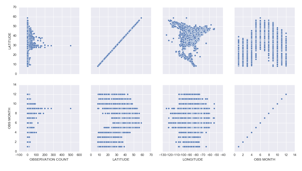
I analyzed a subset of data from the eBird bird observation dataset from Cornell Ornithology for these activities. Some highlights included:
– Learning how to use the pandas python package to explore a dataset (code)
– Learning how to create cool exploratory visuals in Seaborn and Tableau. Here is an example scatterplot matrix made in Seaborn:
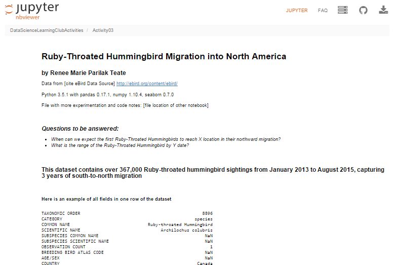
– I was most excited to learn how to build interactive Jupyter Notebook inputs, which I used to control Bokeh data visualizations to display Ruby-Throated Hummingbird migration into North America (notebook). Unfortunately, until I host them on a server where you can run the “live” version, you won’t be able to see the interactive widgets (a slider and dynamic dropdowns), but you can see a video of the slider working here:
Here’s my final output for Activity 3, a Jupyter Notebook (with code hidden, and unfortunately interactive widgets disabled) with the Q&A about the hummingbird migration:
Ruby-Throated Hummingbird Migration into North America
Activity 4 was built as a catch-up week for those of us who were behind, but had some ideas of math concepts to learn for those who had time.
We’re currently working on Activity 5, our first machine learning activity where we’re implementing Naive Bayes Classification.
All of my work is available in this github repository: https://github.com/paix120/DataScienceLearningClubActivities
I strongly encourage you to click through the forums and look at some of the other data explorations the members have been doing, including analysis of NFL data, personal music listening habits, transportation in London, German Soccer League data, top-grossing movies, and more!
It’s never too late to join the Data Science Learning Club! If you aren’t sure where to start, check out the welcome message for some clarification.
I’ll post again when I complete some of the machine learning activities!
]]>Renee Teate interviews Clare Corthell, founding partner of summer.ai (now Luminant Data) and creator of the Open Source Data Science Masters curriculum, about becoming a data scientist.
Podcast Audio Links:
Link to podcast Episode 5 audio
Podcast’s RSS feed for podcast subscription apps
Podcast on Stitcher
Podcast on iTunes
Podcast Video Playlist:
Youtube playlist of interview videos
More about the Data Science Learning Club:
Data Science Learning Club Welcome Message
Learning Club Activity 5: Naive Bayes Classification
Data Science Learning Club Meet & Greet
Resources/topics mentioned by Clare in the interview:
Management Science and Engineering
Markov Chains
Science, Technology, and Society at Stanford
A Challenge to Data Scientists (blog post Renee mentioned)
Mattermark
Product Management
Machine Learning
Open Source Data Science Masters
Nate Silver’s book The Signal and the Noise
Linear Algebra (on Khan Academy)
Bill Howe’s Introduction to Data Science Coursera Course
Recurrent Neural Nets
Bayesian Networks
Open Source Data Science Masters on GitHub (pull requests welcome!)
summer.ai (Update 2/15 – Clare’s company is now Luminant Data, Inc.)
@ClareCorthell on twitter
Other links:
SlideShare Slides about Open Source Data Science Masters
Talk Clare gave at Wrangle Conference about AI Design for Humans
]]>In Episode 4 of the Becoming a Data Scientist Podcast, we meet Sherman Distin, owner of analytics consulting firm QueryBridge. We discuss his primarily self-taught path to learning the data science techniques he uses to find business insights in marketing data, and he also tells us what he thinks is the most important trait he looks for in data scientists.
Podcast Audio Links:
Link to podcast Episode 4 audio
Podcast’s RSS feed for podcast subscription apps
Podcast on Stitcher
Podcast on iTunes
Podcast Video Playlist:
Youtube playlist of interview videos
More about the Data Science Learning Club:
Data Science Learning Club Welcome Message
Learning Club Activity 4: Learn a New Math Concept [to be posted Tuesday]
Data Science Learning Club Meet & Greet
Resources/topics mentioned by Sherman in the interview:
QueryBridge (Sherman’s business)
Target Pregnant Customer story
Survival Analysis
Proportional Hazards Model
@ShermanDistin on Twitter
]]>In Episode 3 of the Becoming a Data Scientist Podcast, we meet Shlomo Argamon, who is the founding director of the Master of Data Science program at Illinois Institute of Technology. He talks to us about his path to data science, including research in robotic vision and natural language processing, we discuss the traits of a good data science student, and he gives some advice for those of us learning data science.
Podcast Audio Links:
Link to podcast Episode 3 audio
Podcast’s RSS feed for podcast subscription apps
Podcast on Stitcher
Update 1/19: You should be able to find it on iTunes now!
Podcast Video Playlist:
Youtube playlist of interview videos
More about the Data Science Learning Club:
Data Science Learning Club Welcome Message
Learning Club Activity 3: Business Questions and Communicating Data Answers [to be updated Monday]
Data Science Learning Club Meet & Greet
Here are the links to things Shlomo references in the video:
Illinois Institute of Technology – Professional Master of Data Science Degree
machine vision
robotic mapping
Google Scholar Search for Shlomo Argamon’s publications related to robotics
“Passive map learning and visual place recognition” Doctoral Dissertation [ps.gz from yale]
probability theory
probability distributions
statistical inference
bayesian statistics
Natural Language Processing (NLP)
Google Scholar Search for Shlomo Argamon’s publications related to language
“Automatically Categorizing Written Texts by Author Gender” [Moshe Koppel, Shlomo Argamon, and Anat Rachel Shimoni]
Weka
scikit-learn
Natural Language Toolkit (nltk)
Ethics in Data Science at IIT
Becoming a Data Scientist – A Challenge to Data Scientists (re: bias)
In Episode 2 of the Becoming a Data Scientist Podcast, we meet Safia Abdalla, who started programming and even exploring machine learning and natural language processing as a teenager, and is now a student at Northwestern University, a conference speaker and trainer, co-organizer of PyLadies Chicago, and a contributor to Project Jupyter.
Podcast Audio Links:
Link to podcast Episode 2 audio
Podcast’s RSS feed for podcast subscription apps
(I will distribute the feed out to iTunes and Pocket Cast ASAP. It’s available on Stitcher now!)
Podcast Video Playlist:
Youtube playlist where I’ll publish future videos
More about the Data Science Learning Club:
Data Science Learning Club Welcome Message
Learning Club Activity 2: Creating visuals for exploratory data analysis
Data Science Learning Club Meet & Greet
Here are the links to things Safia references in the video:
information retrieval
Introduction to Information Retrieval by C. D. Manning, P. Raghavan, H. Schütze
natural language processing
NLTK
machine learning
Northwestern Neuroscience and Robotics Lab
pyladies
Chicago PyLadies Meetups
mathematicalmonk’s YouTube series on machine learning
@captainsafia on twitter
Safia’s website
Safia’s blog
JupyterDay Chicago 2016 (post by Safia on jupyter.org)
Jupyter documentation
In this episode we meet Will Kurt, who talks about his path from English & Literature and Library & Information Science degrees to becoming the Lead Data Scientist at KISSmetrics. He also tells us about his probability blog, Count Bayesie, and I introduce Data Science Learning Club Activity 1. Will has some great advice for people learning data science!
Podcast Audio Links:
Link to podcast Episode 1 audio
Podcast’s RSS feed for podcast subscription apps
(I will distribute the feed out to sites like iTunes and Stitcher this week)
Podcast Video Playlist:
Youtube playlist where I’ll publish future videos
More about the Data Science Learning Club:
Data Science Learning Club Welcome Message
Learning Club Activity 1: Find and explore a dataset
Data Science Learning Club Meet & Greet
Here are the links to things Will references in the video:
Library and Information Science
Andrew Ng’s Machine Learning course on Coursera
probabalistic graphical models
Count Bayesie blog
Count Bayesie – Parameter Estimation and Hypothesis Testing
Donald Knuth
Literate programming
Claude Shannon’s Mathematical Theory of Communication
Count Bayesie – Measure Theory
Bayes’ Theorem with Lego
Voight-Kampff and Bayes Factor
Black Friday Puzzle – Markov Chains
Zen Buddhism concept of “beginner’s mind”
Count Bayesie Recommended Books on Probability and Statistics
]]>(sorry for the poor video quality!)
In this episode, I talk a little about the podcast, I talk about my own background, and I introduce the Data Science Learning Club. Enjoy!
(Note: Episode 1, the first interview episode, comes out Monday 12/21!)
Podcast Audio Links:
Link to podcast Episode 0 audio
Podcast’s RSS feed for podcast subscription apps
(I will distribute this out to sites like iTunes and Stitcher soon)
Podcast Video Playlist:
Youtube playlist where I’ll publish future videos
More about the Data Science Learning Club:
Blog post about Data Science Learning Club
Learning Club Activity 0: Set up your development environment
Data Science Learning Club Meet & Greet
Here are the links with more info of things I reference in the video:
turtle logo programming language
carmen sandiego
lemmings
SimCity
JMU Integrated Science and Technology (ISAT)
Visual Basic/VB.NET/ASP.NET
MS Access
PL/SQL
Oracle Data Warehouse
IBM Cognos
CGEP UVA Systems Engineering
Systems Engineering
Linear Algebra at Khan Academy
Stochastic Simulation
Optimization
Cognitive Systems Engineering
Principles of Data Visualization for Exploratory Data Analysis
Machine Learning
Naive Bayes
K-Means
Pattern Recognition and Machine Learning (class textbook)
Summer of Data Science
API and Market Basket Analysis
Jupyter
Docker and Jupyter
Doing Data Science by Cathy O’Neill and Rachel Schutt
O’Reilly Data Science Books
(I’ll post more specific books later)
At the end of each podcast episode, I’ll be “assigning” a “Learning Activity” for the Data Science Learning Club. So that is starting tomorrow, too! There won’t be anyone teaching the content, but we’ll be exploring it together for 1-2 weeks between podcast episodes (usually 2 weeks). I’ll post some resources to get everyone started and help out data science beginners, then we’ll each explore the activity on our own with whatever tools and techniques we choose, and we can post our results so we can all learn from one another. If anyone gets stuck, you can post a question to the forum and hopefully someone will be able to help you through it.
I just got the Data Science Learning Club forum set up today, and it’s at this URL: https://www.becomingadatascientist.com/learningclub
Go check it out, register so you can participate, read the Welcome thread, and introduce yourself in the Meet & Greet section! Then tomorrow, the first learning activity will launch and you can get started.
I’m so excited about launching this podcast and data science learning club, and hope this turns out to be a valuable experience for all of us! Keep an eye out on the blog for the podcast post, which should go up tomorrow!
Renee
]]>Data scientists are problem solvers at heart, and we love our data and our algorithms that sometimes seem to work like magic, so we may be inclined to try to solve these problems stemming from human bias by turning the decisions over to machines. Most people seem to believe that machines are less biased and more pure in their decision-making – that the data tells the truth, that the machines won’t discriminate.
Most people seem to believe that machines are less biased and more pure in their decision-making – that the data tells the truth, that the machines won’t discriminate.
However, we must remember that humans decide what data to collect and report (and whether to be honest in their data collection), what data to load into our models, how to manipulate that data, what tradeoffs we’re willing to accept, and how good is good enough for an algorithm to perform. Machines may not inherently discriminate, but humans ultimately tell the machines what to do, and then translate the results into information for other humans to use.
We aim to feed enough parameters into a model, and improve the algorithms enough, that we can tell who will pay back that loan, who will succeed in school, who will become a repeat offender, which company will make us money, which team will win the championship. If we just had more data, better processing systems, smarter analysts, smarter machines, we could predict the future.
I think Chris Anderson was right in his 2008 Wired article when he said “The new availability of huge amounts of data, along with the statistical tools to crunch these numbers, offers a whole new way of understanding the world,” but I think he was wrong when he said that petabyte-scale data “forces us to view data mathematically first and establish a context for it later,” and “With enough data, the numbers speak for themselves.” To me, context always matters. And numbers do not speak for themselves, we give them voice.
To me, context always matters. And numbers do not speak for themselves, we give them voice.
How aware are you of bias as you are building a data analysis, predictive model, visualization, or tool?
How complete, reliable, and representative is your dataset? Was your data collected by a smartphone app? Phone calls to listed numbers? Sensors? In-person surveying of whoever is out in the middle of the afternoon in the neighborhood your pollsters are covering, and agrees to stop and answer their questions?
Did you remove incomplete rows in your dataset to avoid problems your algorithm has with null values? Maybe the fact that the data was missing was meaningful; maybe the data was censored and not totally unknown. As Claudia Perlich warns, after cleaning your dataset, your data might have “lost its soul“.
Did you train your model on labeled data which already included some systematic bias?
It’s actually not surprising that a computer model built to evaluate resumes may eventually show the same biases as people do when you think about the details of how that model may have been built: Was the algorithm trained to evaluate applicants’ resumes against existing successful employees, who may have benefited from hiring biases themselves? Could there be a proxy for race or age or gender in the data even if you removed those variables? Maybe if you’ve never hired someone that grew up in the same zip code as a potential candidate, your model will dock them a few points for not being a close match to prior successful hires. Maybe people at your company have treated women poorly when they take a full maternity leave, so several have chosen to leave soon after they attempted to return, and the model therefore rates women of common childbearing age as having a higher probability of turnover, even though their sex and age are not (at least directly) the reason they left. In other words, our biases translate into machine biases when the data we feed the machine has biases built in, and we ask the machine to pattern-match.
We have to remember that Machine Learning effectively works by stereotyping. Our algorithms are often just creative ways to find things that are similar to other things. Sometimes, a process like this can reduce bias, if the system can identify predictors or combinations of predictors that may indicate a positive outcome, which a biased human may not consider if they’re hung up on another more obvious variable like race. However, as I mentioned before, we’re the ones training the system. We have to know where our data comes from, and how the ways we manipulate it can affect the results, and how the way we present those results can impact decisions that then impact people.
Data scientists, I challenge you. I challenge you to figure out how to make the systems you design as fair as possible.
Data scientists, I challenge you. I challenge you to figure out how to make the systems you design as fair as possible.
Sure, it makes sense to cluster people by basic demographic similarity in order to decide who to send which marketing message to so your company can sell more toys this Christmas than last. But when the stakes are serious – when the question is whether a person will get that job, or that loan, or that scholarship, or that kidney – I challenge you to do more than blindly run a big spreadsheet through a brute-force system that optimizes some standard performance measure, or lazily group people by zip code and income and elementary school grades without seeking information that may be better suited for the task at hand. Try to make sure your cost functions reflect the human costs of misclassification as well as the business costs. Seek to understand your data, and to understand as much as possible how the decisions you make while building your model are affecting the outcome. Check to see how your model performs on a subset of your data that represents historically disadvantaged people. Speak up when you see your results, your expertise, your model being used to create an unfair system.
As data scientists, even though we know that systems we build can do a lot of good, we also know they can do a lot of harm. As data scientists, we know there are outliers. We know there are misclassifications. We know there are people and families and communities behind the rows in our dataframes.
I challenge you, Data Scientists, to think about the people in your dataset, and to take steps necessary to make the systems you design as unbiased and fair as possible. I challenge you to remain the human in the loop.
The links throughout the article provide examples and references related to what is being discussed in each section. I encourage you to go back and click on them. Below are additional links with information that can help you identify and reduce biases in your analyses and models.
The GigaOm article “Careful: Your big data analytics may be polluted by data scientist bias” discusses some “bias-quelling tactics”
“Data Science: What You Already Know Can Hurt You” suggests solutions for avoiding “The Einstellung Effect”
Part I of the book Applied Predictive Modeling includes discussions of the modeling process and explains how each type of data manipluation during pre-processing can affect model outcome
This paper from the NIH outlines some biases that occur during clinical research and how to avoid them: “Identifying and Avoiding Bias in Research”
The study “Bias arising from missing data in predictive models” uses Monte Carlo simulation to determine how different methods of handling missing data affect odds-ratio estimates and model performance
Use these wikipedia articles to learn about Accuracy and Precision and Precision and Recall
A study in Clinical Chemistry examines “Bias in Sensitivity and Specificity Caused by Data-Driven Selection of Optimal Cutoff Values: Mechanisms, Magnitude, and Solutions”
More resources from a workshop on fairness, accountability, and transparency in machine learning
Edit: After listening to the SciFri episode I linked to in the comments, I found this paper “Certifying and removing disparate impact” about identifying and reducing bias in machine learning algorithms.
Edit 11/23: Carina Zona suggested that her talk “Consequences of an Insightful Algorithm” might be a good reference to include here. I agree!
(P.S. Sometimes the problem with turning a decision over to machines is that the machines can’t discriminate enough!)
Do you have a story related to data science and bias? Do you have additional links that would help us learn more? Please share in the comments!
]]>Thanks to Orlando and Herbierto for having me on!
(P.S. I did put up the post about Data Sources on DataSciGuide)
]]>Books to Read if You Might Be Interested in Data Science
and
Data Sources & APIs for Data Science Projects
Enjoy!
]]>So I started the “Data Science Related Tutorials” Flipboard magazine. Enjoy!
]]>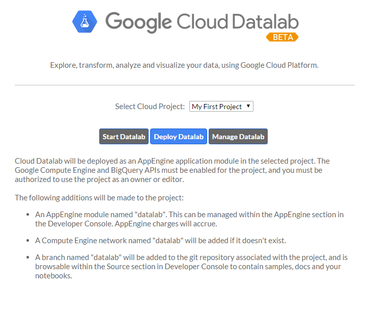
I had a few frustrations with it because the documentation isn’t great, and also sometimes it would silently timeout and it wasn’t clear why nothing was running, but if I stopped all of the services, closed, restarted DataLab, and reopened, everything would work fine again. It’s clearly in Beta, but I had fun learning how to get it up and running, and it was cool to be able to write SQL in a Jupyter notebook.
I tried to connect to my Google Analytics account, but apparently you need a paid Pro account to do that, so I just connected to one of the built-in public datasets. If you view the notebooks, you will see I clearly wasn’t trying to do any in-depth analysis. I was just playing around and getting the queries, dataframes, and charts to work.
I hadn’t planned to get into too many details here, but wanted to share the results. I did jot down notes for myself as I set it up, which I’ll link to below, and you can see the two notebooks I made as I explored DataLab.
Exploring BigQuery and Google Charts
Version Using Pandas and Matplotlib
(These aren’t tidied up to look professional – please forgive any typos or messy approaches!)
Google Cloud Datalab Setup Notes (These are notes I jotted down for myself as I went through the setup steps. Sorry if they’re not intelligible!)
]]>Check it out! https://flipboard.com/@becomingdatasci/becoming-a-data-scientist-5ktft1lky
]]>———————–
A few things I should say first…. I think “data science” can be replaced by just about any other topic, but especially science & tech topics, so please keep that in mind as you read this. I follow a bunch of scientists on my “regular” personal twitter account @paix120, and I sense the same things going on in their communities as I’m about to outline for data science.
Another thing I want to mention is that I’ve had other “topical” twitter accounts. I created one called @womenwithdroids when I started a blog of the same name, and I was amazed at how many awesome women I met that were building android apps, wanted to learn more about how to use their android phones (which at the time were being marketed as a “manly” alternative to the “cutesy” iPhone), and wanted to join a community of women talking about android phones and apps. At the time, I had created a separate account because I saw it as a “business” account for my blog, but I realized that there was a lot of value in separating that from my personal account. I’ll go into that below. Now that you know a little background, let’s dive into how you can use twitter to learn just about anything.
———————–
I have explained to people I meet in person how much I gain from Twitter, and they often look at me like I’m a little nutty. I have heard a few recurring comments from them that I see as misconceptions:
- “I started using Twitter and was overwhelmed. I couldn’t keep up with my timeline.”
My answer to that is that first, you’re not supposed to “keep up” with your Twitter timeline. I don’t use Facebook, but I get the impression that people that do will scroll back through every post that happened since the last time they visited, to make sure they don’t miss any important info from their friends. Twitter is not like that.
On Twitter, you can jump on when you need a 5-minute break from work, read a few tweets, mark some longer stories to read later or go read an article or two now, and then get right back to work. People that use twitter won’t get mad if you miss one of their tweets. If something resonates with a lot of people, it will be retweeted and you will probably see it later. If not, it’s not a big deal. You see what you see when you’re online, and don’t worry about what you may have missed, it will just stress you out.
Think of Twitter like the news. You may want to see if anything has just happened, what’s at the “top of the news”, or what people are talking about that happened recently. If there is a big news story, it will likely still be visible when you visit later. It would be stressful to try to keep up with every news article that’s published at any time.
I just scroll back a half hour or so and scroll up until I’m ready to do something else. If I’m looking for tweets about a specific topic, I do a search and see what the top tweets are for it. You can narrow down the search results to “People You Follow” if you only want to see what people you are connected with are saying about the topic.
- “I started using Twitter and it was just a bunch of junk I didn’t care about.”
Twitter has an onboarding problem. The problem used to be that when you started a new account, you weren’t following anyone, then people would feel lost and not know how to find interesting accounts to follow. Then they started suggesting interesting accounts. Now, the onboarding process shows you a whole bunch of “brand” accounts to follow (whether those are celebrities or companies, they are usually accounts generated to gain followers or money), then they also try to get you to import your email contacts and follow all of them. I don’t know about you, but I don’t care much about what celebrities have to say, and many of my email contacts are people that I had a short business exchange with years ago and have no interest in keeping up with now. It’s no wonder people start with an uninteresting and overwhelming timeline.
My recommendation is that if there is someone in your timeline that frequently annoys you or tweets boring stuff, unfollow them. That’s just clutter. If you see a friend retweet something from someone you don’t follow that is interesting, click on that person’s profile, read a few tweets and see if they are tweeting other things that interest you, and if so, follow them. Constantly tailor your timeline to work for you.
Another important suggestion is to use twitter lists. If there are certain people that you really do want to keep up with (like personal friends, or a small group of accounts on a very specific topic), put them in a list. You can also follow them in your normal timeline, but you don’t have to. When you click over to your list, you will see only tweets by those accounts. One example of how I use a list on my personal account is my “Harrisonburg businesses” list. I don’t frequently care about whether a local restaurant is having a special, or if there’s a cultural event going on at our local university. However, when I’m looking for something to do one night, I can click over to that list and see what the local businesses are tweeting about today. Are there any cool bands playing in town? A special at a local hangout? I follow very few of those 160+ accounts in my regular timeline, but now I have a collection of them in one place when I do want to scroll back through 24 hours of tweets to find something specific.
- “Social Media is a time suck for me, and I don’t want to add any more social feeds to my life to waste time on”
OK, I can see this. It is easy to get sucked in and spend a lot of time on social media. To me, this is just a reason to optimize your account so it’s beneficial to you. If you’re just reading celebrity gossip and trending topics, are you improving your life? However, if you have a goal to become a data scientist, and you follow accounts that are actually educating you, is it so bad to spend some time “sucked into” a feed that is actually getting you closer to your goal in your “free time” and keeping you up to date on the latest topics that a colleague or future employer may expect you to know about?
———————–
Now that I’ve explained some misconceptions about Twitter, I want to explain why I have a separate account for “Data Science Renee”. I have had my personal account on Twitter since 2008. I have only really been into data science since late 2013. I have a “network” of people that I chat with about a variety of topics on my personal account, including political topics and random things that catch my attention. Here are my main reasons for starting a separate account for @becomingdatasci:
-
I personally wanted to separate the topic out. I wanted to go “all in” on data science, and have an account where I ONLY follow people that talk about data science, even people I wouldn’t follow in my normal timeline. I could have done this with a list, but I wanted to take it further than that.
-
I also wanted to be able to tweet like crazy about data science, and not feel like I had to hold back in order to avoid overwhelming my existing followers with a flood of tweets on a new topic. They might unfollow me if I started tweeting 20 times a day about data science when I had rarely mentioned it before, and my new interest might far outweigh my tweets on other topics I’m interested in. I didn’t want to lose that existing network.
-
The opposite is also true. I wanted to be able to connect this new account to my blog, and use it to make work connections, without worrying about including personal political views and tweets about gardening and cute animals in that feed! I also would know that people that follow this account are following it because of data science. I check out my followers on this account more often than I do on my personal account, because they’re more likely to share this particular interest with me.
-
I know I’m good at curating interesting articles about a topic, and I wanted this account to be considered a “go to” account that others could recommend to their friends interested in learning about data science, without worrying what else I might be tweeting about. I decided to become a sort of “learning data science channel”.
———————–
So you see why I have separated this account from my existing personal Twitter account, and how I have tailored it to work for me. But what does that mean? What have I actually gained from this twitter account?
-
I have learned a LOT that I wouldn’t otherwise know about data science. There are terms that I wouldn’t have known to Google that some of the people I follow tweet about and link to articles, academic publications, and tutorials about. There is a constant flow of interesting new information coming out of the data science “industry” so I can keep up with what is being talked about right now and what is considered “state of the art” and exciting to other data scientists. It’s like being able to walk around and listen in on lunch tables at a data science conference. Everyone is talking about something slightly different, but all in the general topic of data science, and each person is honing in on what is interesting or exciting to them within this realm.
-
I have made connections that I wouldn’t have made otherwise. I don’t have a lot of time or money to constantly travel to data science conferences and meet people in person. I live in a small town and there aren’t a lot of other people talking about data science here (yet). Twitter has given me a way to personally connect with other data scientists. I have connected with some that don’t live far from me, after all! I have connected with many that live in other countries that I likely wouldn’t even meet at a conference. These connections have cheered me on in my learning, connected me to resources, and more!
-
I have become a “face” of a person learning data science. At once conference I did attend, I was recognized as “Data Science Renee”! I have been asked to be interviewed on podcasts and blogs (some of those should be coming up soon), offered contract work, and offered free admission to a conference I unfortunately couldn’t go to, but was excited to be considered for. “Famous” people in the industry are now coming to me to work with them in some way. New learners seem to look to me as a resource and guide, and want to see how I learned what I know, and how I have struggled, so they can compare that to their own experiences.
-
I have found many other women working in data science. When I was first learning about data science, all of the “who’s who” lists of people to follow, people that were interviewed for books or other resources, and the “faces” of data science were often white or asian men, with maybe one woman or minority included in the group. (This is typical of the tech industry.) However, as I made more and more connections, and started to seek out women and other minorities in the industry, I have been able to connect with them and learn from them and hopefully amplify their voices. I now have a twitter list with almost 450 women that work in data science or statistics, and now that list can be a resource for other women looking for role models like them in the industry!
-
I have learned some specific data science tools and techniques. I regularly see great tutorials on twitter, via blog posts or videos or github links, that show me how to do something I have wanted to learn how to do. These would often be hard to find by searching, but come right to me in my twitter feed where I can bookmark them for later learning sessions.
-
People on twitter have reached out to help me solve problems when I’m stuck. I have received tweets from people that built python packages I was using, people that had resources that could help me, or just people with general advice and feedback! If I’m clear about what I’m doing and where I’m stuck, I now have a strong enough follower base that I will almost always get a helpful answer!
-
Not only do I find out about resources I wouldn’t otherwise have, but I see opinions of others on existing resources. A conversation on twitter about being overwhelmed by the vast amount of things there are to learn in the broad topic of “data science” helped inspire me to bring an idea I had been having to life. I have taken a course online that got really difficult at about the 5th lesson. I didn’t know whether it was just me and I had hit a roadblock, or if a lot of people found that course difficult and I just needed some outside resources to continue with it. I also often don’t know where to start in my long list of bookmarked “things to learn”. But seeing what people tweet about, and how others have learned, really is helping me on my learning journey. You can read about my new website DataSciGuide here. I’m hoping the ratings (and eventually learning guides and a recommender system) there will help others avoid “data science learning overwhelm”. (P.S. I’m now in the phase where I need reviews on the items I’ve posted, so please go rate some things!)
———————–
Hopefully this post has helped you understand how to use Twitter to join a community and learn something you have been wanting to learn! You can really gain a lot from it if you optimize its benefit to you like I have.
I know the question now will be, “so who are the best people to follow on twitter for data science?,” and I’m hesitant to answer that for you since there are so many people out there, some with specific topics that would be better for you personally than what I would recommend. For instance, maybe you are especially interested in learning data science for sports analytics, which is a specific topic I don’t follow many people on.
If you follow me on @becomingdatasci and see who I retweet, you’ll find people that are sharing resources that I think are beneficial, so you can start there. You can’t go by my twitter favorites since I use those as bookmarks and haven’t read many of them yet. You could look through people I follow, but there are a lot of them, and they’re not ranked in a helpful way. You can also follow the list of data science women I mentioned above.
Others that are often good to start with are people with data science blogs, since they’re usually purposely writing to educate others. Here’s a large list of data science blogs that includes the twitter handle of the author or blog where applicable, and is sorted into categories. Check it out! https://blog.rjmetrics.com/2015/09/30/the-ultimate-guide-to-data-science-blogs-150-and-counting/
———————–
So to recap:
Tailor your twitter timeline frequently. Unfollow those that annoy or bore you, and follow new accounts on topics you want to know more about.
If you seriously want to hone in on one topic, or to become a “channel” for a topic, create a separate account for it
Use twitter lists to create small lists of people you especially want to keep up with, or sub-specialty topics you occasionally want to dive into. You can follow accounts in lists that you might not otherwise follow in your timeline.
Actually connect with other people. Find people like you that can be role models for your learning. Ask them questions. Help others out when they ask questions on a topic you know more about. Join the community and the conversation.
Have fun and don’t get overwhelmed! Use others’ opinions and recommendations to carve out your learning path.
Comment below if you have any questions about using twitter to help learn data science!
]]>Here’s more info: http://www.datasciguide.com/review-stuff-and-win-a-40-amazon-gift-card/
]]>A conversation on Twitter today about how people’s names are stored in databases, with stories of frustration from people that have had terrible customer/patient experience because of “unusual” names, made me want to write about this topic. When you search for information on name standards in databases, you will usually get information on field names, lengths, etc. What is harder to find is information on how to store the variety of names in a system of record.
To get an idea of how people are named in different cultures, see w3’s article about it at http://www.w3.org/International/questions/qa-personal-names
Some examples they give of names that may not be entered into a database the “traditional American way” are:
- “Mao Ze Dong” – Mao is the family name, Dong is the given name, and Ze is a generational name common to all siblings in a family. In Chinese script, the names are not separated by spaces.
- “José Eduardo Santos Tavares Melo Silva” – Brazilian name which includes many ancestral family names.
- “Kogaddu Birappa Timappa Nair” – Indian name which includes village name, father’s name, given name, and last name.
You may think that people should just conform their name to our forms, like just choosing three names for “first”, “middle”, and “last”. Or maybe you think the data collection form should just have one entry field for “name” and not split it up. However, it’s not that simple, and the need to format names for various uses (like mailing labels, letters, etc.) provides additional challenges.
Unfortunately, sometimes the challenge is just getting an organization to accept your actual name at all. The next challenge, once your name is in a system of record, is how it ends up used. Different usages can end up complicating things like government IDs and driver’s licenses (if the state ID name rules don’t allow you to use the name that is on your federal record, for instance), insurance claim rejections (when your name doesn’t match up exactly between the doctor’s office and the insurance company databases), or multiple accounts at retail establishments like pharmacies (I have two different accounts at my local CVS, and when picking up medicine always have to confuse the person at the window by mentioning both my maiden and married names. Also, the name on my CVS discount card was mis-entered, so I have to spell my name incorrectly if they need to look that up for any reason).
Here’s my experience with a “nontraditional” name, since I got married and wanted to make my maiden name a 2nd middle name:
Luckily, I didn’t have trouble changing my name with social security, despite scary stories from other women I know who had to fight to get their name the way they wanted it on their card. Side note: one benefit I’ve since discovered is that since my new name on my driver’s license still includes my maiden name, it makes me more believable when I show up somewhere that doesn’t have my married name and I’m trying to get them to change it.
My Birth Name: Renée Marie Parilak
(I leave off the accent when entering on forms because that would just increase the chance for entry error, like Rene’e or Renee’. Yes, I’ve seen both.)My Married Name: Renee Marie Parilak Teate.
First name “Renee”, middle name is now “Marie Parilak”, and last name “Teate”.When I submitted this name on name change forms with credit card companies and other organizations, I had a few challenges, like not enough room on the middle name line, but I sent in all of the forms with my full name. My credit cards came back with all of these variations printed on them, depending on each company’s conventions:
- Renee Marie Parilak Teate
- Renee M. Teate
- Renee M. P. Teate
- Renee M. Parilak (yes, one came back unchanged)
Actually, the other card that came back unchanged was my voter registration card. I filled out the update form at the polls because they gave me a hard time last time I voted and had different names on my “proof of identity” information, and they mailed me a new card with my old name on it. Really.
Another has my full name correct when concatenated, but has stored my last name as Parilak Teate instead of Teate.
Here’s a friend’s experience (with names removed for privacy purposes):
My parents, to forestall in-law fights over naming, made it so that the first name of all their female children was my mother’s middle name (which is what she goes by…family tradition of female going by middle name), so we are all named “SharedFirstName MiddleName Surname”. Every girl child was meant to be called by her middle name and so it has been.
Many bureaucracies that have forms that force everyone into using their middle initial only (if they even acknowledge the middle name). It’s been a problem throughout my life, especially at doctor’s offices, but it escalated enormously with the connection of various bureaucratic systems to the internet.
The latest wrinkle started about 2 years ago when one of my sisters moved from the family home to an apartment. She filled out a USPS change-of-address form. Suddenly, not just her mail but some of my mail, my mom’s mail and my sisters’ mail started going to her apartment. Our small-town postal personnel suggested workarounds, none of which worked. It wasn’t as simple as going to the post office, showing ID to prove who we were, and having postal personnel escalate it to whoever is in charge of that database. We tried repeatedly to get the mistake corrected by personally visiting our local post office and talking with the supervisor.
Meanwhile, my sister moved out of that apartment, meaning she was no longer there to reroute that mail to us. My mom, my sister, and I, who are all on Social Security (for age or disability) started to find Medicare and other important SocSec mail now had that apartment address on it instead of our true address. No one from USPS or SocSec ever contacted the address/contact of record to verify we wanted an address change. We have different Social Security numbers and you’d think that would be enough to double-check we weren’t the same person despite slightly similar names, but no. This points out how easy it would be for a ID thief to get a bunch of your most sensitive information re-routed to them. Google has a simple check-in when someone logs in from a strange computer or tries to change the password, yet USPS and Soc Sec don’t??
While this was going on, I’d tell medical providers to be sure to address bills using my middle name as the first name so it wouldn’t be rerouted, which it would be if they used my first name and middle initial, which happens to be identical to one of my sisters’ names in that format. They’d refuse or beg off, saying that their biller took care of that and there was no way to get that kind of customization. So despite being a customer who didn’t want to shirk my bills, who was being pro-active about it all, I ran the risk of running up huge medical bills because of mail going somewhere else and medical offices being so maddeningly subject to the almighty database that they would not avoid sending their mail into a black hole.
A couple months ago I tried to call Soc Sec to get advice about something. Even to get advice, they ask you your SS#, mother’s maiden name and other stuff. When I gave my mother’s maiden name over the phone, the operator told me I was wrong! WTF! She was ENORMOUSLY rude to me when I tried to let her know what mistake was happening.
I was fed up with years of this and called my congressperson’s office. So far, they’ve dropped the ball completely. I guess it’s The White House next. Which is a waste of my time, a waste of gov’t time, etc. All of this could have been avoided if good database design practices prevailed (and if bureaucratic organizations would quit distancing customers/clients from reaching the person in the organization who would be capable of making changes to the database once you’ve proved that you are YOU and have always been YOU).
In the ariticle linked above, w3 addresses some “implications for field design” for name fields, including field length, whether to split the name up, etc. I suggest you go read it. Here’s the link again.
If I were designing a name entry form today (Note: for a system that actually needs to store full names! Not all of them do!), I would ask the user for:
- Prefix: [Mr., Ms., Rev., etc. – optional, could allow “other” entry]
- Given/First Name(s):
- Middle Name(s): [optional]
- Family/Last Name(s):
- Maiden Last Name: [if applicable]
- Suffix(es): [Jr, III, Esq. etc. – optional, allow “other” entry]
- Full Legal Name: [optional, would default to First, Middle, Last]
- What should we call you? (Preferred given name or nickname if desired): [auto-fill with Given name. allow user to edit]
- Preferred Mail Name: [auto-fill with prefix, first, middle, last, suffix. allow to edit]
Note: if this were a mobile form, I wouldn’t ask for all of the name variations up front! Complicated mobile forms are a turn-off and can result in lost customers, so just ask for either full legal name (and have your code guess how to split the full name into first/middle/last fields) or first and last, and “What do you want us to call you?”, then have a detailed profile page that lets them go in later and fix anything your system got wrong.
In my case, I would be able to specify that my first name is “Renee” and my last name is “Teate”, and the other two names are my middle names. My friend could specify her full legal name and also that she prefers to be addressed as her middle name and not her legal first name. Mao Ze Dong could specify that Mao is the Family Name and Dong is the Given name, while still leaving the names in the original order for the full legal name.
Make sure your database can handle all of the variations that may be written on a paper form. Also make sure you can handle special characters.
Another Note: If you are going to display the name publicly in any way, like on a user profile on a website, you have to give the person full control over how they want their name displayed there. There are various safety and personal reasons a person may not want their name displayed the way you want to display it. Here’s one example story. Also see Nymwars.
And if my system were something like a medical insurance record where past names may come in from doctor’s offices even though I have the patient’s current name, I might ask for a list of past names to keep on the record. You can store several “former names” in a table with a one-to-many relationship to the person’s primary record, and store all of the prior name fields when a new name comes in. You can even store names that aren’t their actual name, but may come in from another system regularly (like a misspelling) or be an incorrect version of their name that you stored in the past.
When in doubt, you can use the full legal name on communications. If sending an informal email, you can use the “What should we call you?” name. If sending a formal letter, you can use the Preferred Mail Name. Someone could have the preferred mail name of “Mr. J. Edgar Hoover” (funny that’s the name that came to mind as an example of first name initial when I’m writing about storing personal information), but prefer to be called “Ed” in person, and it’s good for your organization to know.
If you have spouses in your database, the marriage record should store preferred informal and mailing joint names, like “Mr. and Mrs. Doe” or “John and Jane”, and not just auto-generate the combinations dynamically (though you could default to that), since some couples have strong preferences on how their names are shown in letter salutations (like wanting the wife’s name first, or preferring to always be referred to formally – I work in a fundraising organization, and they definitely want to address large donors’ names they way they want them!). A relatively safe way to do envelope labels is to have “stacked” name labels, where both spouses’ preferred mailing names are completely written out and listed one above the other. This avoids uncomfortable situations in cases where the spouses have different last names, for instance. Also, you can then handle cases that some systems have trouble with, such as “Drs. Jane and John Doe”, or professional/military prefixes and suffixes in a certain order.
Speaking of marriage, there is a great article on storing a variety of marriage relationships in your database, called “Y2Gay“. It’s a good read for database designers or anyone that has to think about data issues!
Besides having a system that can respond to customer preferences (following their preferences will make them happier customers; rejecting an insurance claim because the first/middle/last names don’t exactly line up with your record will not), having all of these name variations does help in a data science way as well: you can now better match profiles coming in from different systems and have a higher degree of confidence that you are pulling incoming data into the correct “Mary Smith” record, for instance.
Hopefully, our stories made for some food-for-thought for people designing databases, websites, and processes involving people’s names!
Please share your experiences, thoughts, and comments on my database field choices below!
Here are some other references on the topic:
Bad assumptions programmers make about names
Using External Data in Data Matching
Data Models and Real World Alignment
]]>
My main motivation is that I keep hearing people say (and sometimes feel myself) that learning to becoming a data scientist on your own using online resources is totally overwhelming: there are so many different possible topics to dive into, few really good guides, lots of impostor-syndrome-inducing posts by people you follow that make you feel like they’re so far ahead of where you are and you’ll *never* get there…. but there’s so much great data science learning content online for everyone from beginners to experienced data scientists!
We need a better way to navigate it.
Hence my new website: “Data Sci Guide”. It will eventually have a personalized recommender system and structured learning guides and all kinds of other features to help you find the resources to go from where you are to where you want to be, but for now it’s “just” a directory / content rating site. And it’s not ready for you to interact with yet, but it’s getting there, and I’ll need your help fleshing it all out soon.
So go take a look! Then come back here to give me feedback and suggestions, because you have to be registered to comment there and I didn’t turn on new user registration yet.
OK go now. Don’t forget to come back!
>>>> DATA SCI GUIDE.COM <<<
So…. what did you think? What do you think of the overall idea and plans? What should I be sure to remember to include? Tell me below!
]]>
I posted earlier about using the UsesThis API to retrieve data about what other software people that use X software also use. I thought I was going to have to code a workaround for people that didn’t have any software listed in their interviews, but when I tweeted about it, Daniel from @usesthis replied that it was actually a bug and fixed it immediately! It makes it even more fun to develop since he is excited about me using his API!
@BecomingDataSci: YES! It’s *awesome*.
— The Setup (@usesthis) June 19, 2015
After seeing those results, I thought it would be interesting (and educational) to learn how to do a Market Basket Analysis on the software data. Market Basket Analysis is a data mining technique where you can find out what items are usually found in combination, such as groceries people typically buy together. For instance, do people often buy cereal and milk together? If you buy taco shells and ground beef, are you likely to also buy shredded cheese? This type of analysis allows brick and mortar retailers to decide how to position items in a store. Maybe they will put items regularly purchased together closer together to make the trip more convenient. Maybe they will place coupons or advertisements for shredded cheese next to the taco shells. Or maybe they will place the items further apart so you have to pass more goods on the way from one item to the other and are more likely to pick up something you otherwise wouldn’t have. Online retailers can use this type of analysis to recommend products to increase the size of your purchase. “Other customers that added item X to their shopping cart also purchased items Y and Z.”
Because I had this interesting set of software usage from The Setup’s interviews, I wanted to analyze what products frequently go together. I searched Google for ‘Market Basket Analysis python,’ and it led me to this tweet by @clayheaton:
I just wrote a simple Market Basket analysis module for Python. #analytics https://t.co/aVf58zcHJa
— Clay Heaton (@clayheaton) April 4, 2014
I followed that link and checked out the code on github and it seemed to make sense, so I put the results of my usesthis API request into a format it could use. I did a test with the data from 5 interviews, and it ran. Then I tried 50 interviews, and the results showed that people that use Photoshop were likely to also use Illustrator, and vice-versa. It appeared to be working!
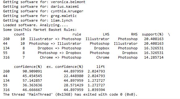
However, I then hit a snag. I tried to run it with all of the software data, and it ran for a long time then crashed when my computer ran out of memory. Since it’s building an association graph with an edge for every rule (combination of software used), with up to two pieces of software per “side” of the rule (such as “people that have Photoshop and Illustrator also have a Mac”), you can imagine the graph gets pretty big when you have over 10,000 user-software combinations.
I tweeted about this and Clay suggested modifying his code to store the items in a sparse matrix instead of a graph, and I agree that that sounds like a good approach, so that’s my next step on this project. I’ll post again when I’m done!
]]>Then, I tweeted about my experience, and got 2 responses encouraging me to use the requests library instead of urllib that codecademy used.
@BecomingDataSci the urllib api is terrible. You should take a look at http://t.co/CzIPob2tBV
— Daniel Moisset (@dmoisset) June 1, 2015
@dmoisset @BecomingDataSci 2nding using of requests over urllib; esp. with HTTPS, requests tends to do saner things (e.g., cert validation)
— Cheng H. Lee (@chenghlee) June 1, 2015
I decided to redo what I had learned from scratch, but using requests. I also wanted to learn how to use IPython, so I used an IPython notebook to play around with the code. Below is the HTML export of my IPython notebook, with comments explaining what I was doing. I’m sure there are better ways to do what I did (feel free to comment with suggestions!), but this was my first time doing any of this without any guidance, so I don’t mind posting it even if it’s a little ugly :) I definitely spent a lot of time understanding the hierarchy of the NPR XML and how to loop through it and display it. If you have done something similar in a more elegant way, please point me to your code!
Here are the main resources I used to learn how to do what is in the code:
- python requests library documentation
- NPR API documentation
- python lxml library documentation
- iPython videos
I also wanted to mention that there are a lot of frustrations you can run up against when you’re a python beginner. I was having a lot of problems with seemingly basic stuff (like installing packages with pip) and it took a couple hours of googling and asking someone for help to figure out there was a problem with my path environment variables in windows. I’ll post about that another time, but I just wanted to 1) encourage people not to give up if you get stuck on something that seems to be so basic that most “intro” articles don’t even cover it, and 2) encourage people writing intro articles to make some suggestions about what could go wrong and how to problem-solve.
Here’s one example: When I tried to export my IPython notebook to HTML, it gave me a 500 server error saying I needed python packages I didn’t already have. After I installed the first, it told me I needed pandoc, so I installed that as well, but it kept giving me the same error. It turns out that you have to run IPython Notebook as an Administrator in Windows in order to get the HTML export to work properly, but the error message didn’t indicate that at all. This is the kind of frustration that may make beginners think they’re not “getting it” and give up, when it fact it’s something outside the scope of what you’re learning. Python seems to require a lot of this sort of problem-solving.
(Note: on my other laptop, I installed python and the scipy stack using Anaconda, and have had a lot fewer issues like this.)
Without further ado, here’s my iPython notebook! (I’m having issues making it look readable while embedded in wordpress, so click the link to view in a new tab for now, and I’ll fix for viewing later!)
Renee’s 1st IPython Notebook (NPR API using requests and lxml)
Here’s the actual ipynb file if you have IPython installed and want to run it yourself: First Python API Usage**
**NOTE: WordPress wouldn’t let me upload it with the IPython notebook extension for security reasons, so after you download it, change the “.txt” extension to “.ipynb”!
select fiscal_year, donorid,
    (case when DonorID IN (select donorid from Donations d1 where d1.fiscal_year = d.FISCAL_YEAR - 1 and HardCredit > 0) then 'Retained'
         when DonorID IN (select donorid from Donations d2 where d2.fiscal_year >= d.FISCAL_YEAR - 5 and d2.FISCAL_YEAR <= d.fiscal_year - 2 and HardCredit > 0) then 'Reactivated 2-5'
         when DonorID IN (select donorid from Donations d3 where HardCredit > 0 and d3.FISCAL_YEAR < d.FISCAL_YEAR - 5 ) then 'Reactivated Lapsed'
         else 'Acquired Donor'
         end)  FY_DonorType
from Donations d
    where Donor_Record_Type = 'A' and HardCredit > 0
    group by fiscal_year, donorid,  (case when DonorID IN (select donorid from Donations d1 where d1.fiscal_year = d.FISCAL_YEAR - 1 and HardCredit > 0) then 'Retained'
         when DonorID IN (select donorid from Donations d2 where d2.fiscal_year >= d.FISCAL_YEAR - 5 and d2.FISCAL_YEAR <= d.fiscal_year - 2 and HardCredit > 0) then 'Reactivated 2-5'
         when DonorID IN (select donorid from Donations d3 where HardCredit > 0 and d3.FISCAL_YEAR < d.FISCAL_YEAR - 5 ) then 'Reactivated Lapsed'
         else 'Acquired Donor'
         end)
         ;
So in the Donations table, there is one row per donor per gift. There can be multiple gifts in a fiscal year, but as soon as the first gift is made, the donor can then be given a FY_DonorType using a CASE statement. If the donor also gave last year, then the donor is “Retained”. If they have given in the past, they’re “Reactivated”. I separated out those reactivated in the last 2-5 years and those that hadn’t given for longer, since once a donor had not given for 5 years, they are considered “Long Lapsed” and much harder to reactivate. If the donor had never appeared in the table before, he or she is a New donor and marked as “Acquired”. We are not looking at how many people gave last year but not this year (“Lost”), but only the breakdown of who this year’s donors are.
Since the code groups by fiscal year and donor ID, and the case statements include selects that look at previous years relative to each gift’s fiscal year, you can look at how the “current year” donors break down every year. Each year is relative to the previous years.
This allows us to make visualizations that give some insight into how the fundraising team performed each year. Some years, the fundraising organization was particularly good at reactivating lost donors. Some years they retained donors from the previous fiscal year at a high rate, but the ones that hadn’t given for more than a year must not have been targeted well and fell off more than usual. This is likely a result of how often they solicited each group, and what type of solicitations were used. (I purposely hid the Y-axis and other info since I’m using this for illustrative purposes and not trying to give away details related to the fundraiser.)
What database tables do you have that could be analyzed in this way?
]]>Principles of Data Visualization for Exploratory Data Analysis [presentation – pdf]
Principles of Data Visualization for Exploratory Data Analysis [paper – [pdf]
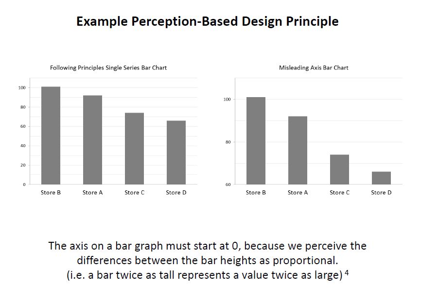
Check out the references in both documents for some good resources. I’ll include some links in the post below, too. I had a lot more material from my research that I wanted to include and just didn’t have time to in a 15-minute presentation! The professor was happy about the topic I picked because she’s teaching a class on Data Visualization next semester, so I think that worked out in my favor :)
These two books by Stephen Few covered the very basics of visualization for human perception:
Show Me the Numbers: Designing Tables and Graphs to Enlighten
Now You See It: Simple Visualization Techniques for Quantitative Analysis
Blog posts about related topics:
Six Revisions: Gestalt Laws
eagereyes: Illustration vs Visualization
Detailed visualization of NBA shot selection
Publications and articles:
IEEE Transactions on Visualization and Computer Graphics
Toward a Perceptual Science of Multidimensional Data Visualization: Bertin and Beyond by Marc Green, Ph. D.
Scagnostics by Dang and Wilkinson
Generalized Plot Matrix (GPLOM) by Im, McGuffin, Leung
UpSet: Visualization of Intersecting Sets by Lex, Gehlenborg, Strobelt, et al.
…and there are more resources in the paper and presentation files! (and if you’re REALLY interested in this topic, post a comment and I will add even more links I have bookmarked)
I also did a project using some data from my day job related to university fundraising and major gift prospects, but unfortunately I can’t share that study here because I don’t have permission to do so. It included some cool visuals like bubble charts, and also an interesting analysis of movement through the prospect pipeline using Markov Chains. I learned a lot doing that one!
It was nice to end my final semester of grad school with two data-related projects! (Yes, I’m finally graduating! Masters of Systems Engineering! woo hoo!)
]]>This podcast about machine learning is educational and, though academic, is pretty accessible to people interested in learning more about the field even if you’re new to it. It is executive produced and co-hosted by Katherine Gorman along with co-host Ryan Adams, an Assistant Professor of Computer Science at Harvard.
They start out by interviewing attendees and presenters from the NIPS (Neural Information Processing Systems) conference, including Hannah Wallach and Max Welling, among others.
Today, I listened to this episode with Charles Sutton, who covered some interesting topics such as using machine learning and natural language processing on computer code for tasks such as understanding how different programmers involved in open source projects name variables, and suggesting naming conventions to new project participants. The larger goals of the research were really interesting to me, and Charles Sutton was really clear and easy to understand, even though he was touching on some heavy concepts.
I also like how the show answers questions submitted by listeners each episode.
This show has two director/developer/data scientists from Ushahidi, Chris Albon and Jonathan Morgan, who talk about recent data science items in the news, and chat about the implications and add their opinions. I like that they link to the news articles on the podcast site so you can read up on what they’re referring to.
Honestly, I didn’t enjoy this one as much as I did the others. The episode I listened to started out with each of them explaining what beer and wine they were drinking, and how much they had had, and some inside joking and laughing, which already made me cringe a bit (their latest episode is called “morning drinking edition”), but I wanted to hear them out. They talk about plenty of interesting topics, but I had already read most of the articles they referred to via twitter. They had some good insights, including a discussion about Uber and data collection (and data selling) by companies in general, and some interesting food for thought about what all of that means for us in the future, but overall, I found their “bro-y” banter a bit annoying.
However, if you don’t get a chance to keep up with data science in the news, or you enjoy feeling like you’re hanging out with some guys from school drinking and chatting about data science topics, then definitely give it a listen. I imagine a lot of people would like their style more than I did – just not my thing.
TED Radio Hour is an NPR production where they take TED talks and group them by topic, then Guy Raz interviews the speakers and basically refactors the talks so they tell an overarching story as a group and sound good on radio. The episode I wanted to point you to is “Solve for X” because it made me think about math in a fun way, and they do incorporate some talks about machine learning algorithms into this one as well. This podcast is one of my go-tos when I want to learn something interesting that is presented in a fun and curious way.
Invisibilia isn’t a tech podcast, but does sometimes talk about technology. The episode, “Our Computers, Ourselves” tells the stories of some interesting people that “let technology go to their heads”, I guess you can say. The only thing I don’t like about the show is that sometimes think the intelligent co-hosts Alix and Lulu purposely make themselves come across ditzier than necessary, but overall I highly recommend checking this one out. Also take a listen to the episode “How to Become Batman” that might change your mind about how expectations impact outcomes, even in scientific research.
Last but not least, I happened upon NPR’s Snap Judgment podcast with Glynn Washington because it had an episode called “Artificial Intelligence” that came up in a search. It turned out not to be about AI in the sense that developers think about AI, but it has some great storytelling involving human-computer interactions, and really made me think about the human side of all of this technology we are creating. This is a fun one that also gets deep, check it out!
Here are some that I have not yet listened to:
Data Stories (Data Visualization)
Linear Digressions
The Data Skeptic
Tell me if you listen to any of these and what you think, or if you have any additional recommendations – I still have a few weeks of commuting to school remaining, and would love to learn what you love to listen to!
Update 4/24/15:
I have now listened to an episode of each of the podcasts I linked at the end of the post above, and here’s what I thought:
Data Stories: I listened to the episode where hosts Enrico Bertini (who commented on this post!) and Moritz Stefaner interviewed Jen Christiansen from Scientific American. She shared information about her history designing information visualizations for different publications and leading design teams, and detailed the process of creating visuals for Scientific American, which means balancing between making the graphics accessible to a general audience, while also satisfying the scientific readers. Really interesting! I will be listening to more Data Stories in the future.
Linear Digressions: This is the one from Udacity with Katie Malone and Ben Jaffe, and I listened to the 2 episodes about Hidden Markov Models, where they invited a guest (who was a listener!) to explain his work with HMMs. It was really interesting to learn about, with the right balance of technical info and accessibility for beginners, and I will listen to more episodes! The only issue I had with this one was the sound quality. I was surprised it was really hard to hear the guest at times, since they were supposedly in the studio of a company that produces online videos. So, my only suggestion to them would be to work on the volume levels and audio in general to make it more professional sounding.
The Data Skeptic: I listened to the episode about Computer-Based Personality Judgments, where Kyle Polich interviewed Youyou Wu about her research into predicting personality traits using Facebook likes, then he and his wife Linhda responded to the “magic sauce” results based on their own profiles. It was an interesting topic, and I really like how they ask the guest to suggest further reading of their own and others’ work, and then link to everything on their blog. I had a hard time finding info like Kyle’s last name, so I hope they put more info on their website’s home page and make the site a little more inviting, because the podcast itself seems very accessible and fun!
Additionally, I found two more podcasts on Matt Fogel’s post about data science and machine learning podcasts:
Learning Machines 101: I started listening to the episode about “How to Learn Statistical Regularities using MAP and ML Estimation” and honestly I didn’t make it more than 5 minutes into the recording. First, the intro is very long and you don’t get to the content until almost 2 1/2 minutes in, then it sounds like the host is just lecturing by reading from a piece of paper and over-enunciating so it sounds like you are being “talked at”, and it was not engaging to me because of that speaking style. So, I’m sure it has some interesting content, but I just couldn’t focus on it while driving. Sorry!
I haven’t had a chance yet to listen to the O’Reilly Data Show Podcast with Ben Lorica, but the little I heard sounded promising and I’m going to get back to it when I drive to class (for the last week, yay!) next week, so I’ll update here again later.
]]>I’ve been so busy with projects lately (for work, class, personal), that I haven’t been able to do as many data science learning projects as I’ve wanted to, but I have been reading up, and I wanted to share some articles I recently found interesting with you!
The first is “Crushed It! Landing a data science job” by Erin Shellman, which I received via the Get a Data Science Job newsletter.
Erin talks about her recent experience with various types of Data Science interviews, which ended in her being hired at Amazon Web Services. She gives great advice about how to prepare for these interviews, as well as a ton of great resources for learning. I’ve definitely bookmarked several of her book and course recommendations.
Advice from Erin Shellman: “Take the time to be sure that you can explain core concepts in your own words. Screening questions are commonly phrased like this: “how would you explain to an engineer how to interpret a p-value?” Explain it to an engineer, someone who, presumably, isn’t a statistician and might not be used to that language. You don’t want it to be the first time you’ve had to rephrase basic definitions like that. Also, don’t underestimate what nerves can do to your ability to recall information, even stuff you really thought you understood.”
Check out her full post here: http://www.erinshellman.com/crushed-it-landing-a-data-science-job/
The second article interested me, because about a year ago when I heard about UrtheCast, I was brainstorming data-sciencey projects that could be done with satellite image data, and thought it would be so cool to learn how to identify and track large mammals like elephants and whales from space. Well, guess what? It’s already being done!
If you think you like elephants and whales now, just wait until you see them FROM SPACE http://t.co/bz6ND5wKkC
— Parker Higgins (@xor) March 28, 2015
The article Parker Higgins is referring to in the tweet above is from The Atlantic, and details how analysts at DigitalGlobe were able to identify elephants in the Democratic Republic of Congo and help protect them from poachers. A different team at DigitalGlobe used an algorithm to spot whales surfacing near the coast of Argentina from ocean imagery – how cool!
At the Girl Develop It! meetup where I talked about data science, some of the participants and I had questions about using geospatial/GIS data for various types of analysis, and decided to schedule a new meetup. My husband knows some professors that do research in this area, and there were a couple people at the meetup that also had some experience with satellite imagery, so I’m going to plan a follow-up meetup to discuss that topic in more depth. Keep an eye on this blog for any announcements about that. I’m thinking maybe late May?
I always tweet interesting articles I read, so for more, follow me on Twitter!
]]>So hello, I’m Renee Marie Parilak Teate, and I’m becoming a data scientist :)
I’m about to give a talk/Q&A for our local Girl Develop It! Central Virginia chapter via Google Hangout on March 18 at 7pm EST as part of their “Day in the Life of” series featuring women in technical roles. Here’s the link:
Day in the Life of a Data Analyst PLUS “What is Data Science?” with Renee Teate
I would love for any ladies following this blog to attend and say hi!
Update
I think the meetup went well! (Other than issues with Google Hangouts On Air not allowing as many people as I read it would allow… I need to figure out how to include “viewers” that aren’t in the limited set of “video participants” for the future.) I was nervous and ad-libbing a lot of it, trying to balance between making it understandable for beginners, but including some info for the more advanced viewers. It’s tough giving a talk like this for a general audience. I had fun, though! I’ve gotten good feedback from a few attendees, and we also discussed a future meetup focusing on Geospatial/GIS data, so that was exciting!
Here is the powerpoint from the data science part of my talk: What is Data Science? (PDF)
The books and some of the courses we talked about are listed here, and there are links to the ones I have reviewed: Learning page
For those of you that weren’t able to attend, there is a recording of the meetup here: YouTube
I’ll list more links in the comments as I come across them this week!
]]>——————————————-
“MANUAL” APPROACH USING EXCEL
So first I started out by seeing if I could create a scoring model in Excel which could be used to classify the patients. I started with the Cleveland data set that was already processed, i.e. narrowed down to the most commonly used fields. I did some simple exploratory data analysis on each field using pivot tables and percentage calulations, and decided on a value (or values) for each column that appeared to correlate with the final finding of heart disease or no heart disease, then used those results to add up points for each patient.
For instance, I found that 73% of patients with Chest Pain Type 4 ended up being diagnosed with heart disease, where no higher than 30% of patients with any other Chest Pain Type ended up with that result. So, the people that had a 4 in the “chest pain type” column got 2 points. For Resting Blood Pressure, I grouped the values into 10-point buckets, and found that patients with a resting blood pressure value of below 150 had a 33-46% chance of being diagnosed with heart disease, where those with 150 and up had a 55-100% chance. So, patients with 150 or above in that column got an additional point.
Points ended up being scored for the following 12 categories:
- Age group >=60
- Sex = male
- Chest Pain Type 4 [2 points]
- Resting Blood Pressure group >= 150
- Cholestoerol >= 275
- Resting ECG > 0
- Max Heart Rate <= 120 [2 points], between 130 and 150 [1 point]
- Exercise-induced Angina = yes [2 points]
- ST depression group >=1 [1 point], >=2 [2 points]
- Slope of ST segment > 1
- Major Vessels colored by Fluoroscopy = 1 [1 point], >1 [2 points]
- thal = 6 [1 point], thal = 7 [2 points]
This was a very “casual” approach which I would refine dramatically for actual medial diagnosis, but this was just an exercise to see if I could create my own “hand-made” classifier that could actually predict anything. So at this point I had to decide how many points merited a “positive” (though not positive in the patients’ eyes) diagnosis of heart disease. I tried score thresholds of between 6 and 9 points, and also tried a percentage-based scoring system, and the result with the most correct classifications was at 8 points. (8+ points classified the patient as likely having heart disease.) However, the 8-point threshold had a higher false negative rate than the lower thresholds, so if you wanted to make sure you were not telling someone they didn’t have heart disease when they in fact did, you would use a lower threshold.
The final results with the 8-point threshold were:
| true positive | 112 | 37% |
| false positive | 18 | 6% |
| true negative | 146 | 48% |
| false negative | 27 | 9% |
| correct class | 258 | 85% |
I remembered that the symptoms for heart disease in males and females could look very different, so I also looked at the “correct class” percentages for each sex. It turns out that my classifier classified 82% of males correctly, and 93% of females. Because of how long it took to create this classifier “the manual way”, I decided not to redo this step to create a separate classification scheme for each sex, but I decided to test out training separate models for men and women when I try this again using Python.
TESTING THE MODEL
I made the mistake of not checking out the other data sets before dividing the data into training and test sets. Luckily the Cleveland dataset I used for training was fairly complete. However, the VA dataset had a lot of missing data. I used my scoring model on the VA data, but ended up having to change the score threshold for classifying, because the Cleveland (training) dataset had rows with an average of almost 11 data points out of 12, but the VA (test) dataset only averaged about 8. So, I lowered the threshold to 6 points and got these results:
| true positive | 140 | 70% |
| false positive | 38 | 19% |
| true negative | 13 | 7% |
| false negative | 9 | 5% |
| correct class | 153 | 77% |
This time, separating out the sexes, it classified only 67% of the females correctly, but 77% of the males. However, there were only 6 females (out of 200 records) in the dataset, so that result doesn’t mean much.
I think classifying 77% of the records correctly is good for a model created as haphazardly as this one was! I learned good lessons about checking out all of the available data before starting to develop a plan for training and testing, and also again encountered an imbalanced dataset like I did in one of my graduate Machine Learning class projects.
——————————————-
AUTOMATED DATA MINING USING PYTHON
Now that I “played around” with creating my own model in Excel, I wanted to use code to create a classifier in Python. I had already written a classifier in Python for one of my other projects in Machine Learning grad class, but wanted to do it more quickly (and probably more correctly) using commonly-used Python packages designed for this type of work.
I decided to learn how to use the Pandas library since I had heard it makes the import and manipulation of data sets much simpler, and try both the Nearest Neighbors and Decision Trees classifiers from scikit-learn.
I had a little trouble getting everything set up the way it needed to be. I eventually got the right versions of the scipy-stack and scikit-learn in Python 3.3. Because I already had it installed and am familiar with it, I’m using Visual Studio as an IDE, but I’m probably going to drop that soon for something leaner. Commenters on Twitter suggested checking out Anaconda/miniconda for easy installs, so I plan to take a look at that soon.
I read the documentation on pandas and scikit-learn and figured out how to import data, manipulate it (For instance, some of the values were question marks. When I made the classifier in Excel (above), I deleted these. This time, I turned them into numeric values because the classifiers couldn’t handle Null values. I need to learn how to best handle these in a future practice session.)
Here is an example of importing the data from the CSV into a pandas dataframe:
#import the Cleveland heart patient data file using pandas, creating a header row
#since file doesn't have column names
import pandas as pnd
header_row = ['age','sex','pain','BP','chol','fbs','ecg','maxhr','eiang','eist','slope','vessels','thal','diagnosis']
heart = pnd.read_csv('processed.cleveland.data', names=header_row)
Here is where I converted the “diagnosis” values in the file to a 1/0 result (any value above 0 was a heart disease diagnosis):
#import and modify VA dataset for testing
heart_va = pnd.read_csv('processed.va.data', names=header_row)
has_hd_check = heart_va['diagnosis'] > 0
heart_va['diag_int'] = has_hd_check.astype(int)
And here is an example of training the Decision Tree classifier, then outputting the results of various tests:
#classification with scikit-learn decision tree
from sklearn import tree
clf2 = tree.DecisionTreeClassifier()
#train the classifier on partial dataset
heart_train, heart_test, goal_train, goal_test = cross_validation.train_test_split(heart.loc[:,'age':'thal'], heart.loc[:,'diag_int'], test_size=0.33, random_state=0)
clf2.fit(heart_train, goal_train )
heart_test_results = clf2.predict(heart_test)

#put the results into a dataframe and determine how many were classified correctly
heart_test_results = pnd.DataFrame(heart_test_results, columns=['predict'])
goal_test_df = pnd.DataFrame(goal_test, columns=['actual'])
heart_test_results['correct'] = heart_test_results['predict'] == goal_test_df['actual']

#print results of decision tree classification test
print("")
print("Decision Tree Result 1:")
print(heart_test_results['correct'].value_counts())
print(clf2.score(heart_test, goal_test))

#try the scikit-learn cross validation function
print("Decision Tree Cross-Validation:")
scores = cross_validation.cross_val_score(clf2, heart.loc[:,'age':'thal'], heart.loc[:,'diag_int'], cv=5)
print(scores)

#test classifier with other data (note: many values missing in these files)
print("Trained Decision Tree Applied to VA Data:")
heart_va_results = clf2.predict(heart_va.loc[:,'age':'thal'])
print(clf2.score(heart_va.loc[:,'age':'thal'], heart_va.loc[:,'diag_int']))
print("Trained Decision Tree Applied to Hungarian Data:")
heart_hu_results = clf2.predict(heart_hu.loc[:,'age':'thal'])
print(clf2.score(heart_hu.loc[:,'age':'thal'], heart_hu.loc[:,'diag_int']))
Interestingly, the results these classifiers got weren’t much better than my “homemade” classifier above! Here is the output from my code:
Nearest Neighbors (5) Result 1:
True 64
False 36
dtype: int64
0.64
Nearest Neighbors (5) Cross-Validation:
[ 0.62295082 0.67213115 0.63934426 0.65 0.7 ]
Trained Nearest Neighbors (5) Applied to VA Data:
0.615
Trained Nearest Neighbors (5) Applied to Hungarian Data:
0.421768707483
Decision Tree Result 1:
True 75
False 25
dtype: int64
0.75
Decision Tree Cross-Validation:
[ 0.7704918 0.75409836 0.73770492 0.8 0.76666667]
Trained Decision Tree Applied to VA Data:
0.65
Trained Decision Tree Applied to Hungarian Data:
0.683673469388
The Nearest Neighbors classifier was able to classify 62-70% of the training data correctly, and only 61% of the VA data.
The Decision Tree classifier was able to classify 73-80% of the training data correctly, and only 65% of the VA data.
My model in Excel classified 85% of the training data correctly and 77% of the VA data (with a change in the “points” system knowing that the VA file had fewer available columns). In this case, a “human touch” appeared to make a difference!
——————————————-
Overall, I learned a lot from this exercise and will definitely revisit it to improve the results and add more analysis (such as true/false positive and negative counts on the scikit-learn results, filling in the null values or removing those rows, and comparing results if the male and female patients are split into separate datasets to train separate models). I enjoyed learning Pandas and look forward to exploring more of what it can do! If you have suggestions for future analysis of this dataset, please put them in the comments. (Also please let me know if I made any glaring mistakes!) I’ll upload my files (linked below) so you can see all of my “playing around” with the data!
(messy) Excel file with my data exploration and point system for classifying
Heart Disease Classification python code(change file extension to .py after downloading — wordpress won’t let me upload as .py for security reasons)
]]>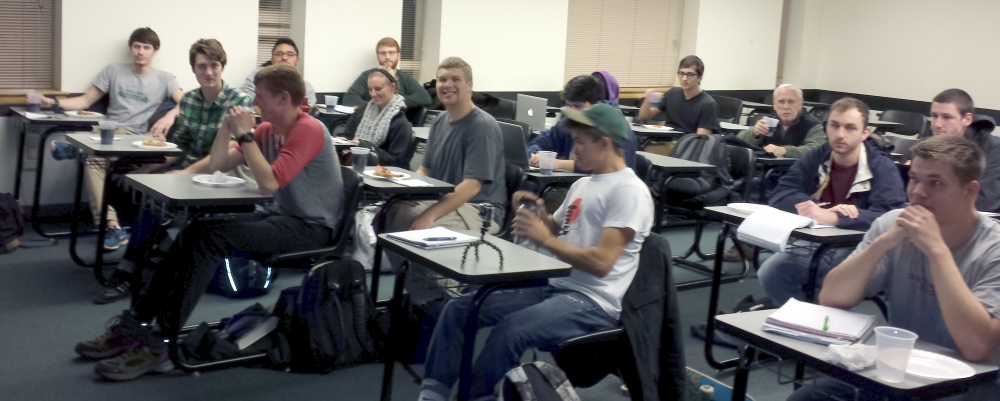
I guess they liked the talk, which was 30-40 minutes, because we ran right up to the time another group needed to use the classroom, and several students stayed afterward to ask more questions in the hallway. Their feedback ranged from “I had never really considered data science, but your talk had me interested, and now I want to look into it!” to another student who already won a machine learning competition in his computer science class. Students shared their data project ideas with me, and asked about whether they were on the right track to possibly have a future in data science. One student took a photo of the books I suggested reading, and I hope several more of them come here afterwards to download the slides with all of the references and links. (I wish I had them done far enough in advance to have this post ready!)
If you are here and you attended my talk, please leave any feedback or questions in the comments below! I may be giving it again, so suggestions are encouraged!
Here is a link to the slides (PDF, so no animations, but the links should work): What is Data Science?
And the companion notes with extra info: Companion Notes
I was excited to get to share my love of data, and get the students thinking about “big data”, how much data they generate, privacy issues, the vast possibilities of data analysis and data science, and a possible future in this field!
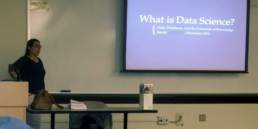
Students: I have removed my full name and personal email from the slides for publication here, so just leave a message below in the comments if you want to get in touch, and I’ll pass my info on to you individually. (Don’t type your email in the comments, I should be able to see it behind the scenes.)
]]>First let me say, I really enjoyed this book! I thought it gave a great overview of Data Science, which is very valuable at this early stage in my data science journey. The authors attempt to define Data Science, but also explain that the definition is evolving, and show throughout the book all of the different types of things that can be categorized as data science activities. I also enjoyed that they emphasize data science teams, and each presenter in the book (each chapter is based on a lecture in the course which had a guest speaker from the field) was introduced with their level of expertise in the various aspects of data science (see image below). For instance, some were more focused on machine learning, while others focused more on visualization, and they were from a variety of different industries. This was nice because it meant the authors didn’t use the same example problems repeatedly when discussing different techniques.
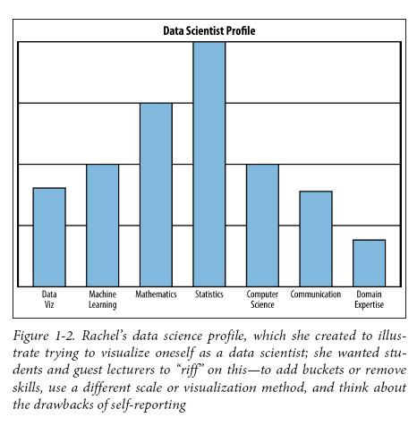
Data Scientist Profile (via semanticcommunity, more here)
Speaking of visualization, I would say that the one negative of the book is that the images were not designed to be printed in black and white, and many are hard to read. There is an image with the caption “red means cancer, green means not”, but the dots all appear to be similar colors of grey. There is an image the students in the class designed to show the various aspects of data science which is basically unreadable because it is tiny and has some text that comes out as grey-on-grey (I happened to find a color version of that image here).
Now, don’t expect to read the book and immediately be able to go out and do all of the activities in the book. First of all, there is a list of prerequisites the authors assume you have. You don’t have to have a deep understanding of all of these fields in order to gain something from the book, but they use terminology at times from linear algebra, statistics, machine learning, and other technical areas, and you would definitely need some of these skills in order to do some of the suggested activities. However, throughout the book are constant definitions and clarifications, references to other texts, websites, and people. I found this to be incredibly useful – any time you want to learn more about a topic, the authors point out how to find more information, and recommend books on the subject.
To make a metaphor, Rachel Schutt and Cathy O’Neil tell you about a great dish someone cooked, and give some general info about the process of making the dish, and what to watch out for when you attempt it yourself. They even include some quotes from the chef about the art of making this particular dish, and tips on preparing and presenting it. But you still have to go out and get the ingredients and tools and learn some cooking techniques and look in some other cookbooks in order to figure out the detailed steps. Then, you have to do a lot of chopping and sautéing and probably burn a few things before you successfully create a similar dish you can serve to your customers. They don’t just hand you a simple recipe, and you are probably a casual at-home cook, not a professional chef yet.
You could describe the book as kind of a “roadmap” to data science. There is some math and some code, but it is much more breadth than depth. The book is not pretentious, and actually warns data scientists against hubris, since overconfidence in a certain tool or method can have negative impact on your work. There are a lot of “tips”, “things to think about”, and “lessons learned” that I feel give the reader a great sense of what pitfalls you might come across when doing real-world analysis, and how to avoid the common ones, but only a few step-by-step how-to’s and code examples (in R or Python).
Some topics I bookmarked to learn more about that I hadn’t read about before “Doing Data Science” introduced them to me: F-score (a combination of precision and recall – terms defined in the book), Log Returns, Simpson’s Paradox, Exponential Random Graph Models.
Some topics I already knew a little about, but “Doing Data Science” helped me better understand: various similarity/distance metrics, exploratory data analysis, data leakage, recommendation engines, confounding variables.
I can imagine that some readers wouldn’t like that the book is “all over the place” and that it gives a combination of not much detail on some topics, and a lot of detail all at once on others; too technical and math-y on some topics, and very “laymans terms” on others. However, I liked that about the writing. It really touches on everything, and gives you enough direction to know where to go next to learn more. It feels like you’re meeting a bunch of people that have had a variety of experiences in the industry, and you’re all trying to give each other a feel for what you do: being technical enough to be impressive, but clear enough to be accessible, and explaining how you learned your particular subset of skills and where someone can get more info.
I give it 5 out of 5, despite the fact that the images were sometimes unreadable. I also suggest you check out the blog that goes with the course that the book follows: http://columbiadatascience.com/blog/.
See more books I’m reading, have read, or plan to read here: Becoming A Data Scientist “Learning” Page.
]]>I settled on using SciKit-Learn (skLearn) Random Forest since I have been teaching myself Python throughout this class and kept seeing references to the skLearn package for machine learning. I like their site, and the documentation was good enough to get me started. skLearn also has tools for preprocessing data, which is something I knew I’d need since I was working with a “real world” data set, so I got started.
First, I decided on what problem to tackle. Since this was a classification project, I decided to see if I could identify people that gave to the university for the first time in a fiscal year, and compared “never givers” (non donors) to “first time donors”. I pulled data such as class year, record type (alumni, parent, etc.), college, zip code, distance from the school, whether we had an address/email/phone number for them, whether they were assigned to a development officer, how long their record had been in the database, how many solicitation and non-solicitation contacts they had with the university, whether they were a parent of a current student, had ever been an employee of the university, etc.
Many of these columns were yes/no (like Has Email) or continous (like distance), so didn’t need any modification except figuring out what to do when the field was null. I wrote functions to return values that I thought made sense for when the field was empty, and figured I’d play around with those a bit when I saw the results. I also tried excluding the rows with empty values in certain columns, but that made the result worse.
So, when I first ran the Random Forest (the code for this part was the easiest part of the project thanks to skLearn!), the scores looked like this:
Overall score: 98%
Class 0: 99%, 141,500 records
Class 1: 16%, 2,300 records
Class 0 had all of the records of everyone that had ever been added to our database for any reason but had not made a gift to the university, while class 1 consisted only of people who had made their first gift in Fiscal Year 2013. As you can see, I learned a lesson about working with an imbalanced dataset.
I learned how to output the “importances” of each column that the Random Forest used to classify the data and started manipulating my dataset. First, I tried “downsampling”, which means that you remove some records from the larger class so it doesn’t contribute so heavily to the results. I also brought in more fields that were categorical, such as the Record Type Codes, and used the skLearn Preprocessing functions “LabelEncoder”, which turned the string categories into numerical values, and “OneHotEncoder”, which then turned those numerical values into 1-of-k sparse arrays with the column value a 1 and every other value a 0. For instance, “AL” for Alumni would be category “1”, and encoded as [1 0 0 0 0 0 0 0 0] if there were 9 possible categories.
Eventually, I got the results to look like this:
Overall score: 99%
Class 0: 99%, 101,750 records
Class 1: 97%, 2,032 records
Now, there are some “wrong” reasons that I could have come out with such good results, so to better understand this (and to be able to use these results to provide any insight to the Office of Annual Giving), I need to figure out how to output the values that the Random Forest is using to classify each point (not just the weights of the columns). I am pretty sure there is a way to do this, but I just didn’t have time during this 2-week project which I mostly worked on late-night while working full time (luckily my manager gave me 2 days off during the final 2 weeks to work on this final project and another for my Risk Analysis class since they were each 30% of my grade). So, that will be my next step in learning how to better work with this type of data.
Additionally, I want to learn how to output some visualizations, such as a “scatter matrix” which plots each column in a dataset against every other column so you can visually spot which have strong correlations. (I plan to learn how to do that using this: Pandas Scatter Plot Matrix)
I also tried to see if my FY13 data could be used to predict FY14 first-time donors. There are some good reasons it wasn’t perfect, but it appears I was able to correctly classify 67% of the data points for first time donors, which I don’t think is too bad.
I have attached my project write-up and some python code if anyone wants to take a look. I can’t attach the dataset because of privacy and permission issues, but a sample row looks like this:
DATA_CATEGORY: FIRST TIME DONOR FY13
CLASSIFICATION: 1
FY14 RECORD TYPE: AL
YEARS_SINCE_GRADUATED: 2
PREF_SCHOOL_CODE: COB
OKTOMAIL: 1
OKTOEMAIL: 1
OKTOCALL: 1
EST_AGE: 24
ASSIGNED: 0
ZIP5: 23219
ZIP1: 2
MI_FROM_HBURG: 98.65
HAS_PREF_ADDRESS: 1
HAS_BUSINESS_ADDRESS: 0
HAS_PHONE: 0
HAS_EMAIL: 1
FY1213_SOLICIT_B4: 2
FY1213_NONSOLICIT_B4: 5
FY1213_SOL_NONOAG_B4: null
FY1213NONSOLNONOAGB4: 4
SOLICITATIONS: 2
NONSOLICITAPPEALS: 5
CURRENT_RECENT_PARENT: 0
EVER_EMPLOYEE: 0
YEARS_SINCE_ADDED: 1.00
YEARS_SINCE_MODIFIED: null
EVENT_PARTICIPATIONS: 0
Any feedback is welcome! I am very relieved that this semster is done, and I plan to spend the summer learning as much as possible about Data Science topics, so throw it all at me! :)
(Again, I have to change the .py file extensions to .txt for wordpress to allow me to upload)
607 ML Final Project Write-Up
Here’s the impressive demo video:
)
And here is a link to the documentation:
http://reference.wolfram.com/language/
I don’t have a Mathematica license or Wolfram Workbench, but I could get a student copy at a discount as a graduate student. Have any of you used the Data Mining side of Mathematica before? How does this new language compare? Have you tried Wolfram Language?
h/t to Data Science 101
]]>